
13 is always the best number to me :).
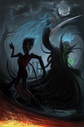
Notice that the Death has many fingers, not 5 as human hand, that's what I intentionally did. He takes to soul of the victim and imprison it in his amulet, eats the victim's heart and thrown to body to the river of magma...
Please view in full to see all the detail. (5 years and 3452 days ago)



amazing one
fantastic work.
Wonderful. I'm loving the lighting on the back and front of the figure, the splash of bright fire-magma in the corner, the way you have small bits of the poor guy flying off him. I especially like the roman numeral 13 almost hidden in the background.

You must be young. I've found that Death isn't nearly so scaring looking, the older we get.
I Love the "up take" of his soul from above and creepy hands pulling him from below....Awesome!
super, good luck!
Great image and well done. good silhouette style
great........
lol I thought this was you, glad to see you in this contest, great work .
.
You really did well in the composition and the colors, and the impact on the visual narrative.
The only crit I have is the moon and the tree, the tree seems abnormally warped to fit the countiours of the moon. I'm not sure if this s a design related element or composition related, but the branches of the tree might appear a lot more sinister by adjusting the contrast from the light on the moon.
Cool.
Brilliant work!!
Amazing work...2 death in the battle for the 1st place...best of luck author
Wicked-Cool!!! GL!!


Congrats for your brilliant second place! I'm sorry, that my magic didn't work this time :S
congrats on the runner up spot, nice entry langstrum .
Langstrum, I love your imagination and the way you put it to use. Congratulations on second place. BTW, I just noticed the hands coming up from the mist. Another wonderful touch on an excellent entry!
Thanks everyone for your comments, critiques, faves and congrats, I'm always happy to see your responses. I wanted the Death to be scary, but somehow I didn't complete my goal, maybe because I'm not scared by it. I so glad to have a chance to compete with jackaloftrades because I've learned much from him, the artist that I really admired from the early period of my study in digital painting. Really exciting to see some similarities or coincidences in this contest. I'm happy with the runner up place, that means I have to work more and more. Thank you IDt8r for your observation, that's nice to know somebody find out the details that I tried to show in the picture. Have a nice new week everybody ^^
congrats

Congrats ... I find this truly frightening ... the hands in particular just have the other side of human feel to them that gives me the shivers. Bravo!
really inspiring entry........ Love the lighting and the pose....... Congrats buddy.....
Howdie stranger!
If you want to rate this picture or participate in this contest, just:
LOGIN HERE or REGISTER FOR FREE