(5 years and 3381 days ago)
Deadman's Hand  by IDt8r 10467 views - final score: 61.5% | I Ain't Bluffin'!  by jawshoewhah 9114 views - final score: 55.8% | lets play  by niks1351 16451 views - final score: 55.8% |
cards  by janetww 10674 views - final score: 55.3% | Fine balance  by ibmaxed 9034 views - final score: 54.1% | good o'l drinkin card games 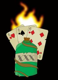 by janetww 7438 views - final score: 53.3% |
Full house  by ibmaxed 9682 views - final score: 52.7% |
Howdie Guest!
You need to be logged in to rate this entry and participate in the contests!
LOGIN HERE or REGISTER FOR FREE
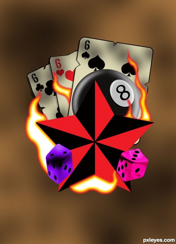
The dice perspective seems to be off, which is taking away from the realism. Similarly, it would be better if the 8 ball and star object also received the light and shadow influences from the fire.
A nice design, but is it realistic? :noclue?
Nice work author...best of luck
This is a very bold design and it has a wonderfully sinister feel to it...except for the dice. The dice seem to be out of place because of the color and shape. Maybe that's what you were aiming for? If you weren't, maybe you could square them up a bit and change the color. I would suggest they compliment the cards by making them the same pale color with red dots on them. Just an idea.
On a side note, is there any significance to each die adding up to 9? Just wondering...
Great job! Love all the aspects of each of the different items you've placed.
Howdie stranger!
If you want to rate this picture or participate in this contest, just:
LOGIN HERE or REGISTER FOR FREE