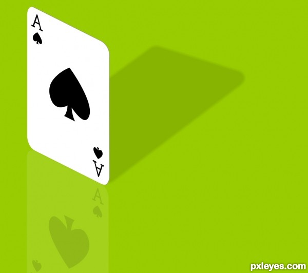
Redone as the original had gradient fills. (5 years and 3382 days ago)
Deadman's Hand  by IDt8r 10472 views - final score: 61.5% | I Ain't Bluffin'!  by jawshoewhah 9119 views - final score: 55.8% | lets play  by niks1351 16459 views - final score: 55.8% |
cards  by janetww 10678 views - final score: 55.3% | Fine balance 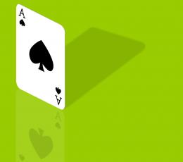 by ibmaxed 9039 views - final score: 54.1% | good o'l drinkin card games  by janetww 7447 views - final score: 53.3% |
Full house  by ibmaxed 9689 views - final score: 52.7% |
Howdie Guest!
You need to be logged in to rate this entry and participate in the contests!
LOGIN HERE or REGISTER FOR FREE
Well-drawn.
I like this. Simple and clever. One small suggestion. You could give the card a little thickness by running a very thin line around the edge we can see. That would give it a more 3D look.
Thnx for input iDt8r, added a subtle line. Cheers Mad.
nice work author...gl
Nice work!
I like the simplicity in this one!!
great!!!
I like that you added the reflection and shadow. Gives the otherwise simple image a bit more to work with.
Howdie stranger!
If you want to rate this picture or participate in this contest, just:
LOGIN HERE or REGISTER FOR FREE