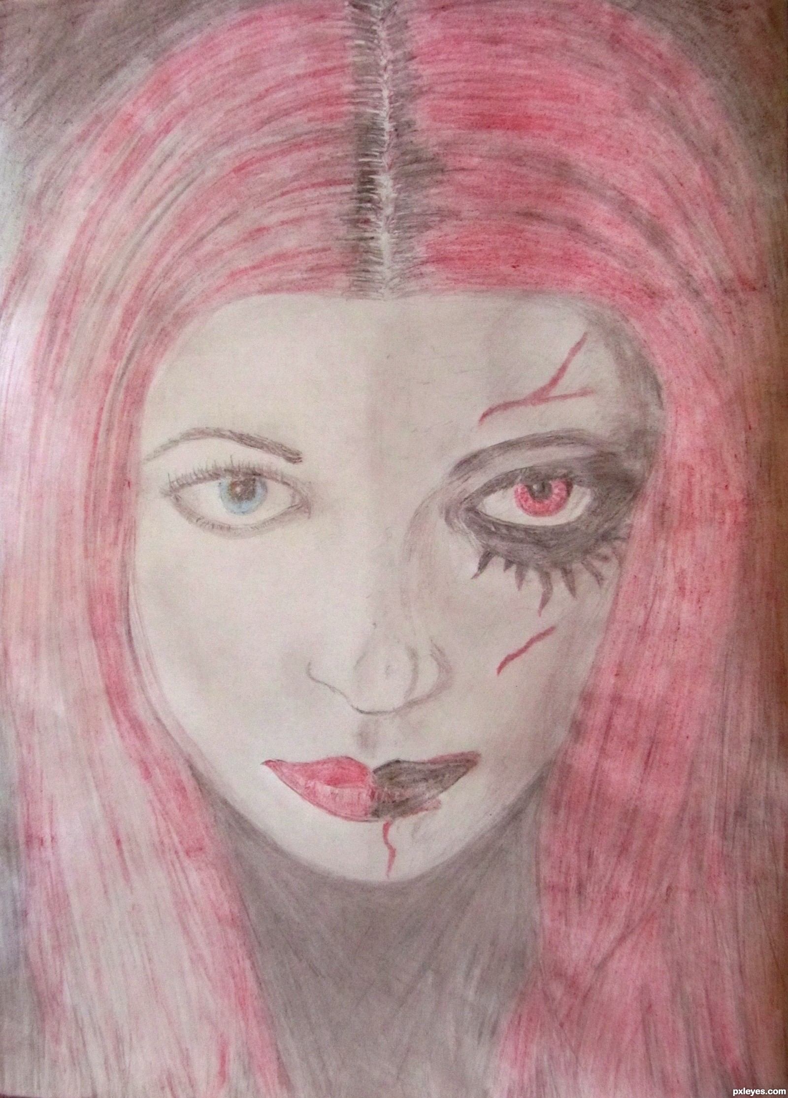
I used two pencils and colouring pencils (Red, Blue, Black, Green, Brown and white) for this drawing. (5 years and 2767 days ago)
1 Source:
- 1: source1
alley oop 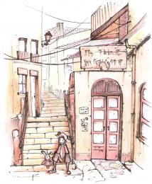 by tk 25093 views - final score: 74.6% | Grace, Beauty, Spirit, Fire  by patypatypaty 27350 views - final score: 71.2% | The beauty of old  by dan1307 26907 views - final score: 68.5% |
The Face with Two Sides 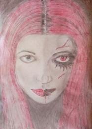 by EmeraldStormcloud 14209 views - final score: 60.2% | cute  by aljhay1973 11356 views - final score: 57.8% |
Howdie Guest!
You need to be logged in to rate this entry and participate in the contests!
LOGIN HERE or REGISTER FOR FREE
Photography and photoshop contests
We are a community of people with
a passion for photography, graphics and art in general.
Every day new photoshop
and photography contests are posted to compete in. We also have one weekly drawing contest
and one weekly 3D contest!
Participation is 100% free!
Just
register and get
started!
Good luck!
© 2015 Pxleyes.com. All rights reserved.


there should be a bit more contrast in your colors , richer and darker areas dispersed though out . the subject is good but just needs a little pop to it.
Thanks Glockman for your comment. I totally agree with you, unfortunately my selection of colouring pencils weren't that great and so was the choice of art paper I used. It was thin paper that crinkled when trying to add more colour. I definitely need to invest in some art equipment/paper that can give better results for these drawing contests, so that it can have that 'little pop' that your talking about.
Author if you have any kind of photo software you can take it into it and adjust the contrast a bit, that would help.
Yes, I do have photo software! I've just done what you suggested. The colours stand out much better now! Thanks for your help!
I agree, better
Howdie stranger!
If you want to rate this picture or participate in this contest, just:
LOGIN HERE or REGISTER FOR FREE