(5 years and 3292 days ago)
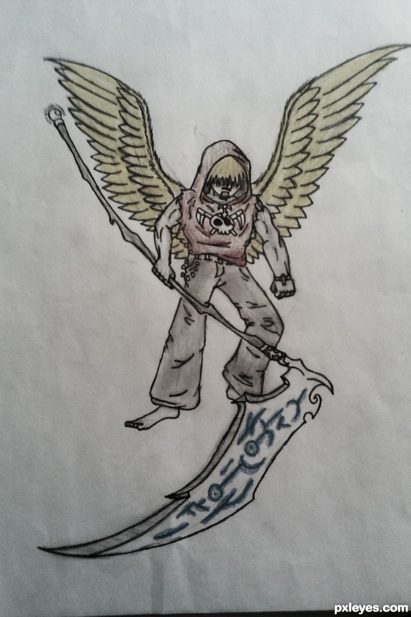
an angel with a bad attitude (5 years and 3410 days ago)
Interesting take on the Angel of Death. Anatomy needs some work, though. One arm is noticeably thicker than the other, his bent knee is too far down, and his torso is really short. Probably explains why he has a bad attitude... 
Howdie stranger!
If you want to rate this picture or participate in this contest, just:
LOGIN HERE or REGISTER FOR FREE
(5 years and 3414 days ago)
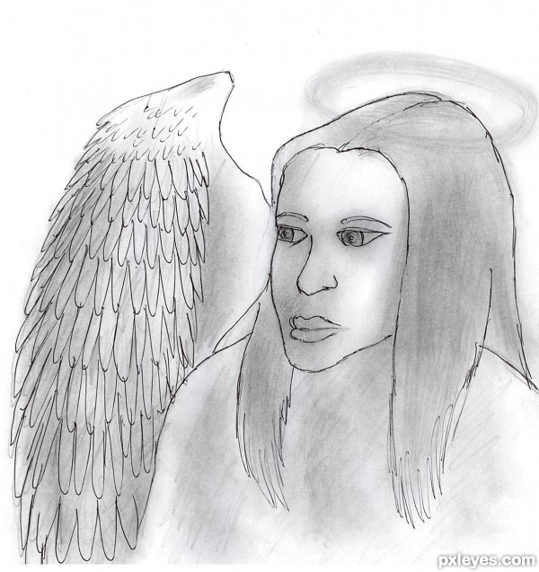
It's a start author, keep up working. when i started drawing i was immitating famous paintors or real photos for practice. In time you'll get better.
sorry but I think that unlike others, it takes 5-10 minutes to draw something like that
Howdie stranger!
If you want to rate this picture or participate in this contest, just:
LOGIN HERE or REGISTER FOR FREE
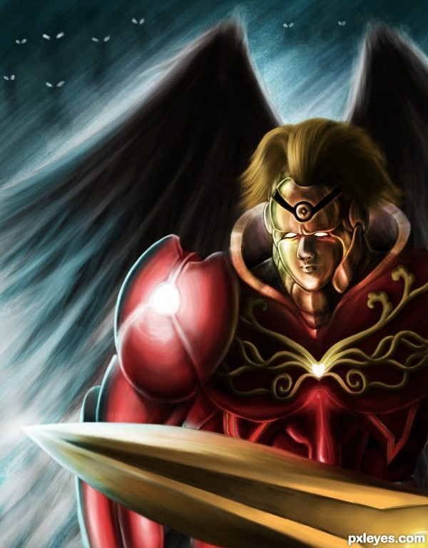
Blood angel collects the blood from the devils to help resurrecting the good spirits...
I can't finish the whole piece as I wanted, so I just choose a part to do, really in hurry :(. I'll take a flight in some minutes, so I just try to finish this work, sorry for the lacking of SBS steps (5 years and 3485 days ago)
err umm.. that sword says a LOT about over compensating for his male inadequacies... hehehehe
great job author 
Really nice one! I see in your sbs you paint in monotone before coloring. I never thought of doing it that way. Learning new things all the time.
My flight is delayed, so now I'm still in the airport... Thanks two of you for your comments. @Slush: Maybe his appearance is inspired by Prince Poppycock (in the natural way lol). @Chad: the way to start a painting is depended on what I like at that moment. But normally to paint something with 3D shape I use monotone, which can be easily achieved, to have the overall imagination about the subject, then I just paint the color following the grayscale with other tones. It's easy with the grayscale because only the brightness of the pixel decides which pixel it is (but with other tone, we have to care about the saturation and intensity at the same time). With grayscale, I just choose the color from black to white (in a straight column in the color panel), but with red color, for example, I have to choose on a curve from bright pink to dark brown. I used to be scared with color work because of that, it's difficult to achieve the natural color gradient, until I painted with Photoshop some months ago, it changed everything...
Looks amazing, really great job! Not so common to see a not so pretty faced hero but this is a surely strong one.
well done... Great stuff
Fantastic work author...face,sword and the background are great,but hair and the armor are simply amazing....well done
Great job . . . . 
amazing work
Congrats buddy...great great great work...keep going man...
Congrats dear friend. . . . 
Congrats! for another amazing work 

congrats
congrats
Astounding as always...congrats, buddy! 
Thanks everyone, I was on vacation so I can't check Pxleyes, sorry for the late reply
Howdie stranger!
If you want to rate this picture or participate in this contest, just:
LOGIN HERE or REGISTER FOR FREE
Dedicate to Glockman. I use his image in the forum as the reference (I mention in the SBS), I asked him to use it, even though I didn't get the response, I think he'll willing to accept that.
I try to make it looked like the watercolor painting but maybe in Hi-Res you can see it more clearly.
(5 years and 3534 days ago)
awsome...!!!!
yup.. awesome it is.. cool.. 
wow incredible
zakaass ! g l
Creative idea and well executed!
Very nice image. It has maybe even too much details for a watercolour painting (the angel and stuff) but.. let's decide it's very big painting, so we can have all your fine details. Very cool design, hi vote from me..
Oh nice , I am very impressed . always wondered what I looked like to other artist's .thank you author.
Nice job. very well done !!!
fantastic job, good luck 
WOW is only thing i have to say...
Well, author, everybody said all I wanted to say... A perfect touch, a great mood, it's a delicate painting. GL! 
Thank you my friends for your appraises, I very appreciate 
Absolutely stunning 
Very good.
Superb idea and nicely executed........Good Luck Author.
Center part very dark, hides all that good work! Well done, tho, interesting concept.
Congrats Langstrum  awesome work
Congrats for 1st, fab
Congratulations on 1st. Beautifully done and terrific idea. 
Thanks again for your comments and congrats  . @pearlie: Base on this and your previous comments of yours in my entries, I guess your monitor is a bit darker than standard (or my monitor is brighter than standard lol) but even though this part is the darkest one, the details are still visible to me
  , but thanks a bunch
  !!
!!
Congrats for 1st. Wonderful work. 
Congrats for your first place, Langstrum! Lovely work 
Congrats !!
Howdie stranger!
If you want to rate this picture or participate in this contest, just:
LOGIN HERE or REGISTER FOR FREE
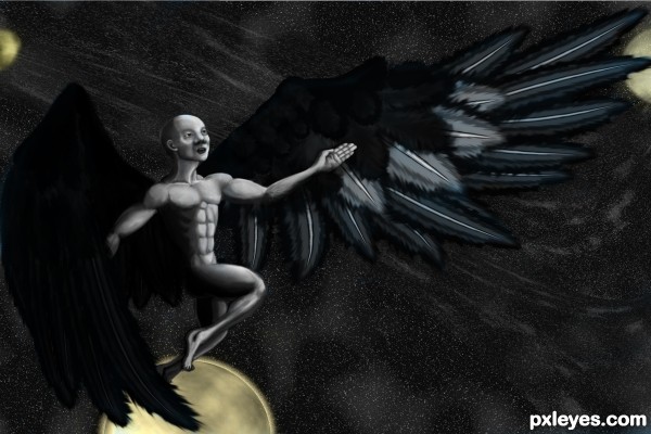
The dark part is accurate...It's hard to see the shape of the angel or the wing(s?), it's so dark. Just a few star clumps, and some bits and pieces of light objects scattered across. It looks like the "wing" on the RH side is exploding away from the arm, and that the angel has only one, incomplete leg...
Too dark.
use some bluish tone on the edges to make it clear...i think it will help...GL
ok, I tried to add a bit more to the leg and added the moons/planets to help with the black sky... better?
yup...better,,,,,
Wonderful job.,
A nice comp, but the character is disproportioned:
his head is too big, and the arms are too long compared to small legs. The longest bone in the human body is the femur ( thigh bone).
Apart that, the levels, textures and wing design work really well.
Howdie stranger!
If you want to rate this picture or participate in this contest, just:
LOGIN HERE or REGISTER FOR FREE