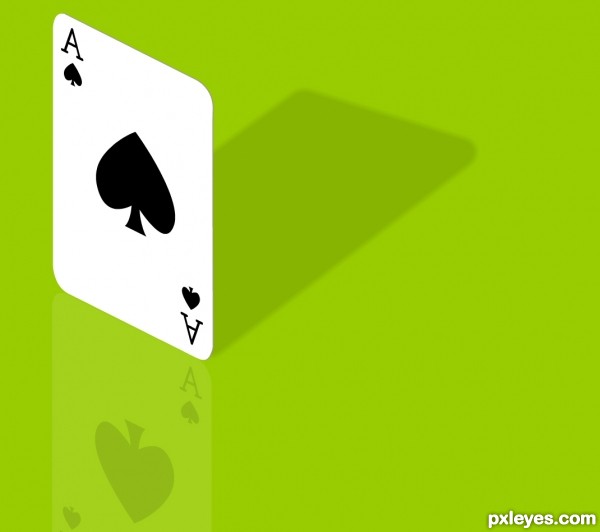
Redone as the original had gradient fills. (5 years and 3364 days ago)
Photography and photoshop contests
We are a community of people with
a passion for photography, graphics and art in general.
Every day new photoshop
and photography contests are posted to compete in. We also have one weekly drawing contest
and one weekly 3D contest!
Participation is 100% free!
Just
register and get
started!
Good luck!
© 2015 Pxleyes.com. All rights reserved.

Well-drawn.
I like this. Simple and clever. One small suggestion. You could give the card a little thickness by running a very thin line around the edge we can see. That would give it a more 3D look.
Thnx for input iDt8r, added a subtle line. Cheers Mad.
nice work author...gl
Nice work!
I like the simplicity in this one!!
great!!!
I like that you added the reflection and shadow. Gives the otherwise simple image a bit more to work with.
Howdie stranger!
If you want to rate this picture or participate in this contest, just:
LOGIN HERE or REGISTER FOR FREE