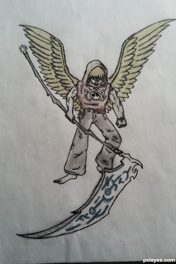
an angel with a bad attitude (5 years and 3428 days ago)

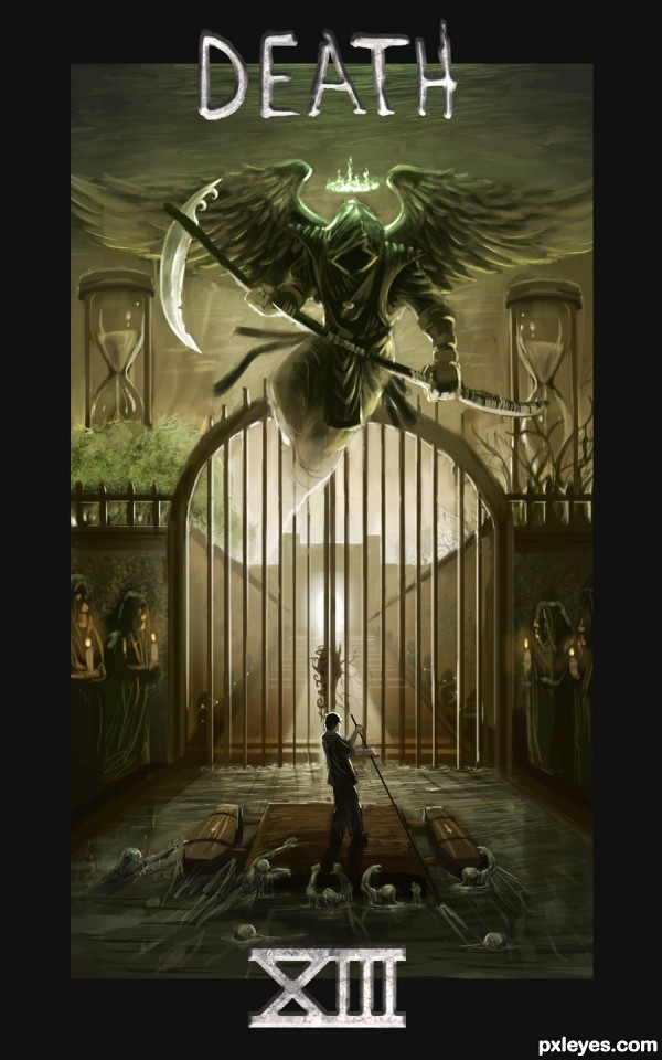
This was sort of last minute and half old work, but I decided to do card #13 Death....
Sorry to person before me, didn't mean to use the same card.
As for the subject matter, I really wanted to portray the feeling of judgement before afterlife. On one side it is heaven, the other is hell (no leaves). The soul is traveling along the river styx, hence the lost souls trying to hitchhike from the protagonist. Of course I had to put in the angel of death, but I gave him a halo of green fire to present his status. I used sort of a Vanitas theme with the hour glasses, presenting death and decay. (5 years and 3446 days ago)
wow awesome work!!!
That's so interesting to have two entries about the same card in this contest, but the approaches are on the opposite ways, one goes to heaven and one goes to hell, what a coincidence! About this work I love everything from the composition, colors and details, especially the river of zombie. The design of the angel is awesomely cool, I always want to make an angel like that. The words don't work well for me tho, and I think because of the constraint in time you decided to use them. Very nice, and high mark from me!
Oh *sigh* beautiful, beautiful, beautiful. The way you have the lighting, the pontoon coffin-raft, the sentries by the gate...everything. I love your vision of card 13 and want to see the rest of the deck.
A personal question, if I may. Have you taken art classes or are you self-taught?
amazing work, love all the little details 
Awesome! GL
Very well done but have to agree with Langstum on the lettering , doesn't fit real well into your image. The lower numerals should be toned down some also as they are a bit distracting. But I love your scene and the quality of your work is very good.
i love the detail ,good luck!
Definitely agree on the text, I wanted to use a boney texture, but it somehow came out metallic, due to a certain chain of events yesterday I had to settle with this.
Super work.
WOW!!! Last minute work??? You should do EVERYTHING LAST MINUTE if it always comes out this great! Nice work!!! ;0)
Wow that's impressive, even tho i don't like the text form. The illustration looks stunning!
Fabulous entry, great execution...simply perfect...i did not expected nothing less from u author...well don
Thanks a bunch for the compliments and the crits everyone  .
.
IDt8r Sorry for not responding sooner, I am currently a student, but I'm self taught in digital painting, apparently now matter how much it is used in the industry, some schools including mine find it less of an art form and only have a few classes that allow digital painting.
Congrats for your first place!  Your talent is amazing!
Well done and congrats on the win
Congratulations! I'm so glad you decided to enter. I admire and enjoy your art work very much. You have the ability to "see" how things are supposed to go, something I'm still working on. If you keep entering these contests (please), maybe I can learn a thing or three from you. 
Congrats Phil  another stunning piece of work
Congrats Phill, so now I have one more painting to learn from, thank you so much for joining this contest.
congrats
congrats
Howdie stranger!
If you want to rate this picture or participate in this contest, just:
LOGIN HERE or REGISTER FOR FREE

13 is always the best number to me :).
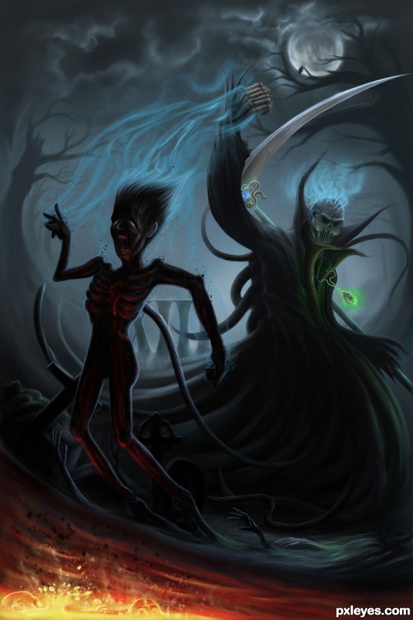
Notice that the Death has many fingers, not 5 as human hand, that's what I intentionally did. He takes to soul of the victim and imprison it in his amulet, eats the victim's heart and thrown to body to the river of magma...
Please view in full to see all the detail. (5 years and 3446 days ago)
amazing one
fantastic work.
Wonderful. I'm loving the lighting on the back and front of the figure, the splash of bright fire-magma in the corner, the way you have small bits of the poor guy flying off him. I especially like the roman numeral 13 almost hidden in the background.
You must be young. I've found that Death isn't nearly so scaring looking, the older we get. 
I Love the "up take" of his soul from above and creepy hands pulling him from below....Awesome!
super, good luck!
Great image and well done. good silhouette style
great........ 
lol I thought this was you, glad to see you in this contest, great work  .
.
You really did well in the composition and the colors, and the impact on the visual narrative.
The only crit I have is the moon and the tree, the tree seems abnormally warped to fit the countiours of the moon. I'm not sure if this s a design related element or composition related, but the branches of the tree might appear a lot more sinister by adjusting the contrast from the light on the moon.
Cool.
Brilliant work!!
Amazing work...2 death in the battle for the 1st place...best of luck author
Wicked-Cool!!! GL!! 


Congrats for your brilliant second place! I'm sorry, that my magic didn't work this time :S
congrats on the runner up spot, nice entry langstrum .
Langstrum, I love your imagination and the way you put it to use. Congratulations on second place. BTW, I just noticed the hands coming up from the mist. Another wonderful touch on an excellent entry! 
Thanks everyone for your comments, critiques, faves and congrats, I'm always happy to see your responses. I wanted the Death to be scary, but somehow I didn't complete my goal, maybe because I'm not scared by it. I so glad to have a chance to compete with jackaloftrades because I've learned much from him, the artist that I really admired from the early period of my study in digital painting. Really exciting to see some similarities or coincidences in this contest. I'm happy with the runner up place, that means I have to work more and more. Thank you IDt8r for your observation, that's nice to know somebody find out the details that I tried to show in the picture. Have a nice new week everybody ^^
congrats

Congrats ... I find this truly frightening ... the hands in particular just have the other side of human feel to them that gives me the shivers. Bravo!
really inspiring entry........ Love the lighting and the pose....... Congrats buddy.....
Howdie stranger!
If you want to rate this picture or participate in this contest, just:
LOGIN HERE or REGISTER FOR FREE

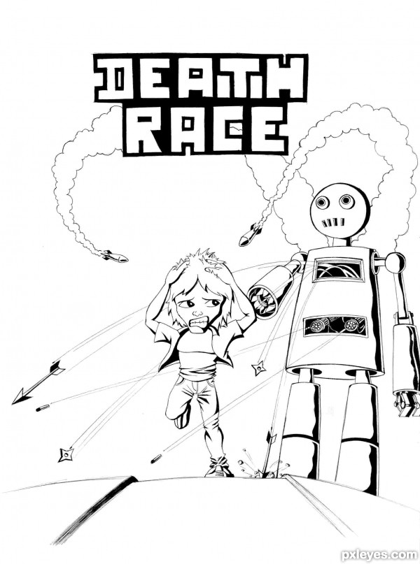
all work done using .5 ball pen (black) and a small pencil...
This may sound familiar. I've used the concept of movie "death race" and try to write a book on this with some modifications. (here ppl runs not cars)
here goes the story :
there was a secrete private organization which wants to make a lot of money. So they come up with new concept of online real death racing. This organization used to kidnapp ppl and from all those kidnapped ppl they put them in different difficulty lvl groups according to thier strength and weekness. And then they are begin send on tracks for racing and ppl who make it to the finish line alive is begin send for another round.
this is all about my story hope u'll like my story and the cover page..
also all comments will be appreciated as always...:D (5 years and 3614 days ago)
Very nice! GL!
Nice work...gl
Congratulations for 3rd
Congrats for 3rd place 
nice... congrats...
Howdie stranger!
If you want to rate this picture or participate in this contest, just:
LOGIN HERE or REGISTER FOR FREE
Interesting take on the Angel of Death. Anatomy needs some work, though. One arm is noticeably thicker than the other, his bent knee is too far down, and his torso is really short. Probably explains why he has a bad attitude...
Howdie stranger!
If you want to rate this picture or participate in this contest, just:
LOGIN HERE or REGISTER FOR FREE