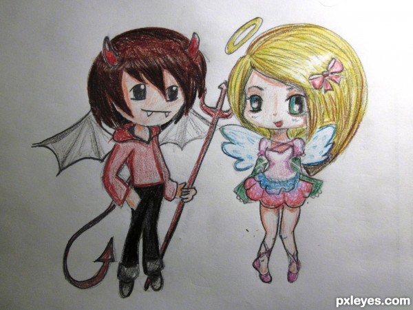
Sorry colors turned out a bit wrong with the picture :/ (5 years and 3434 days ago)
Photography and photoshop contests
We are a community of people with
a passion for photography, graphics and art in general.
Every day new photoshop
and photography contests are posted to compete in. We also have one weekly drawing contest
and one weekly 3D contest!
Participation is 100% free!
Just
register and get
started!
Good luck!
© 2015 Pxleyes.com. All rights reserved.

Your wings need to be consistent in size. On both figures, the wings on the left are larger than the wings on the right...
I agree with Mos- this is cute, though. I'm sure it's the first step to something like this:
http://www.freewebs.com/vilemessiah/luis_royo_fallenangelI.jpg
To MossyB: They're not facing directly to the "viewer" so one side of their body is turned away so the wing should be smaller no? O.o
and WOW greymval, I love that drawing you link. :O
Fantastic cute work author...I like the in-perfection of wings and their great pose...best of luck author
Thank you!!
Howdie stranger!
If you want to rate this picture or participate in this contest, just:
LOGIN HERE or REGISTER FOR FREE