(5 years and 3100 days ago)

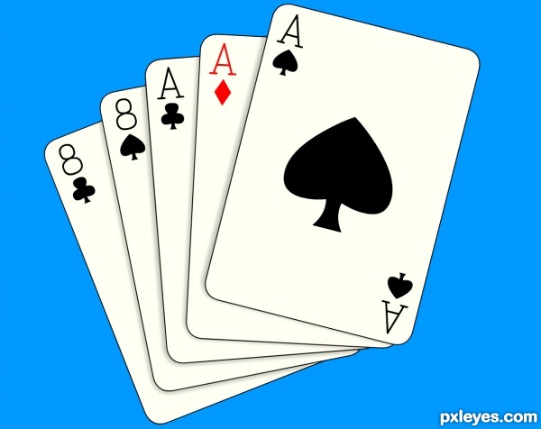
Created in flash using the pen tool mostly. (5 years and 3385 days ago)
Great! IMO the background should be changed to something more eye catching rather than the dull old grey.... GL! 
Cheers toothpick134, the gray was a bit dull.
cool
Simple but a little too illustrative as opposed to realistic. GL.
Simple but effective...gl
Agree with Mad...but you've done a nice job!!
Howdie stranger!
If you want to rate this picture or participate in this contest, just:
LOGIN HERE or REGISTER FOR FREE
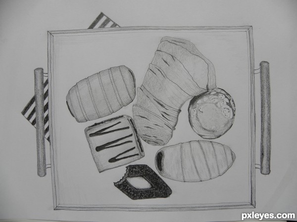
I like the one with the bite out of it! Nice job with the shading values of the tray handles. The treats could use a little more depth with values, they look a bit flat, but a nice image anyway.
Thank you Mossy ! And yes you're quite right about the depth. Some shadows and darker tones would have made the difference indeed. On the other hand we can think about it as a clumsy model on the tray's surface. )
)
I see your stil life got the better of you and you had to have a bite, art is a hungry job.
I like your choice of image, I agree that you have done a wonderful job with the tray handles
Over all i really like your image author , well done.
Well, I plan to eat them all, after all... But only after the contest! ))
))
Thanx scratzilla!
Nice Congrats
Howdie stranger!
If you want to rate this picture or participate in this contest, just:
LOGIN HERE or REGISTER FOR FREE