(5 years and 3028 days ago)

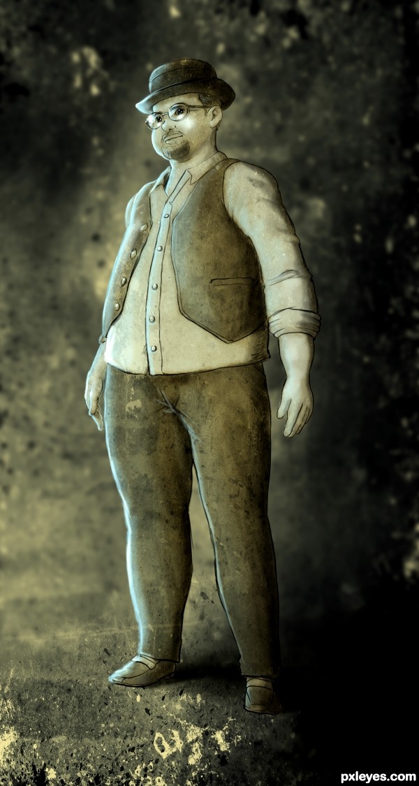
I want to create concept art that feels so old or retro after taking my free time to read the eBook of Treasure Planet today. Then I pick one of the characters that named Dr. Livesey.
---
Dr. Livesey is wise and practical, and Jim respects but is not inspired by him. Livesey exhibits common sense and rational thought while on the island, and his idea to send Ben to spook the pirates reveals a deep understanding of human nature. He is fair-minded, magnanimously agreeing to treat the pirates with just as much care as his own wounded men. As his name suggests, Livesey represents the steady, modest virtues of everyday life rather than fantasy, dream, or adventure.
---
Done in less then 5 hours, with Photoshop CS5 & Wacom Cintiq. Please take your little time to see my SBS though it wasn't good enough to explain everything.
Thank you for reviewing my work, seeing it at the details, hope you'll enjoy this little piece of concept art.
Last but not least, critiques & comments most welcome. (5 years and 3195 days ago)
Impressive!
Thank you, Jerostone~! 
love it!
We have a great artist here.!!!. Gongrats.
yes....one of the great artist here.........with amazing works.....!
Thanks for your comments, everyone... 
Dekwid, I might be no war agent, but art agent... 
Howdie stranger!
If you want to rate this picture or participate in this contest, just:
LOGIN HERE or REGISTER FOR FREE

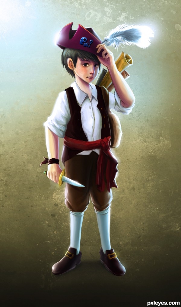
Main Character Concept Art of Treasure Island.
Done with Photoshop CS5 + Wacom Cintiq. Approximately 17 hours of work within 2-3 days while working alongside the other contest theme & commercial projects. +1 hours to remove & change the submitted entry.
P.S. - Still, I'm NO 'pirate boy'. Lol. Make art not war.
(!) Please check my imperfect SBS first before commenting, since I've already (really) tired of it.
EDIT: Removed textures, font, and also my official statements/testimonials. Cropped to fit the composition.
Good Luck to everyone~! (5 years and 3199 days ago)
not to bad, good sbs also, suggestion though, you may want to change the guy's feet around as they appear to be backwards. and lose the signature as it is frowned upon here. but nice work and keep it up.
Beautiful render, love the hat emblem!
The highlights on both sides of the clothing are a bit too high-contrast, they throw off such a strong glow that it is like a huge spotlight is aimed on him from an extremely close distance, or he is radioactive...lol! If you reduce that "glare," it will improve the overall presentation.
Extremely beautiful work (as usual)!
Thanks, MossyB + HUG for the fave. Because of too much photo filter caused the 'radiation' of too much to glare. Lol. Need to down the highlights-tone a bit later. 
Your work is just beautiful.... as Mossy says...... love the idea and your creation. I so not give any suggestions, for me, the final outcome is more than that... awsome! Good luck!
Very nice work and the SBS is nice too!
Oh, thank you so much for your kind words, George55 & hoore10. It's not as good as my usual commercial works. Just want to participate since concept art was one of my job at various studios' projects back then.
ANYHOW, I'm working on the second entry right now; will post 'em anytime soon... Can't wait to battle my guys here. Lol.
wow.....elite work again....!
Thank you, Dekwid. Look forward to see the other entries as well. Good night, good fight.
I love it!
Thank you for your love, k5683 (Kellie). Hehe... 
You are quite the talented one!!!! Bravo author!!!!
Howdie stranger!
If you want to rate this picture or participate in this contest, just:
LOGIN HERE or REGISTER FOR FREE
congratulations!
Howdie stranger!
If you want to rate this picture or participate in this contest, just:
LOGIN HERE or REGISTER FOR FREE