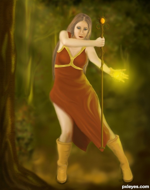
Thanks to SenshiStock for the stock.Used it for pose reference.
I know that the background sucks but I lost my patience/interest spending nearly 15-20 hrs on this. (5 years and 3646 days ago)
1 Source:
- 1: SenshiStock

Thanks to SenshiStock for the stock.Used it for pose reference.
I know that the background sucks but I lost my patience/interest spending nearly 15-20 hrs on this. (5 years and 3646 days ago)
Great drawing style you got! awesome
Nice work...good luck
Good work and good luck author.
Well done, I like the colors.
awwwwwesome
The wand is less sharp and the the face is sharper would change the focus of the image to the mage, not the wand. I like the color, too
@Langstrum : Correct me if I am wrong. If the face is sharper than wand then obviously the focus is on face right?
I guess you meant to say the opposite, when I saw the image the wand was sharper than the rest so I fixed it.Hope its looking better now.
Thanks all for your comments.
nice drawing and coloring style
Very good entry......GL
beautiful drawing
Very good.
I'm sorry for the late response, you're right, maybe I commented when you're fixing this problem, now it's ok . Good luck
very nice job gl
gl
nice
nice composition
Howdie stranger!
If you want to rate this picture or participate in this contest, just:
LOGIN HERE or REGISTER FOR FREE