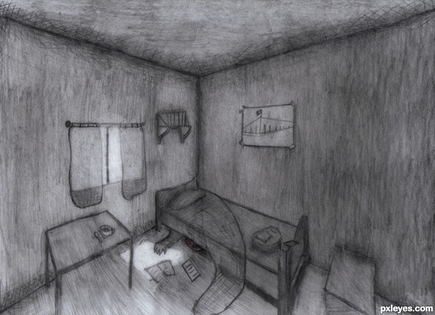
Sometimes you have to reach for something different to find out who you really are. (5 years and 2593 days ago)
(5 years and 3393 days ago)
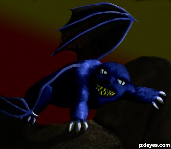
Too dark. Can't make out the creature's shape, and the wings just look like blue twigs...
ok, what do you suggest? I haven't ever drawn wings before - exspecailly on a pc...
as far as it beening too dark ? from the direction of the light source what else, would you have me do?
Author, you could select the "skin/fur" sections of the wings (or create them); then fill with a foreground color to transparent. A look at a bat pic should give you enough of an idea to go from 
I see MossyB's point, but still like what you have done! GL!
Your light source is upper right. The skin on the wings should be showing some refraction/reflection of the light source, even if slight, not just jet black.
If you are not familiar with drawing on a PC, I suggest you do not draw objects with hard lighting and harsh shadows on black backgrounds. Light is NOT pinpoint narrow. It is reflected to varying degrees off of any surface. Fur and skin absorb some amounts of light and then refract it back out, and whatever ground surface (rocks?) would be lit up with a light source as bright as you are using, if the claws are any indication.
Thanks Mossy and sgc for comments
MossyB - if I don't draw those things, how will I ever get better at them?
Plus - entering my mistakes here is a good thing, because of the talent and willingness of all other user's of this site can point me and any one else in need (or wants) - in the direction(s) on how to get better 
edit - added a shadow to the rocks, and tried to add a felling of transparency to the wings (although I'm still not sure there is enough light hitting the wings.....---....) 
Your exactly right author. Keep at it. With wings you need to multi layer, especially for translucency. Both mossy and sgc have some helpful pointers. GL
very cool fluffy monster...gl
Howdie stranger!
If you want to rate this picture or participate in this contest, just:
LOGIN HERE or REGISTER FOR FREE
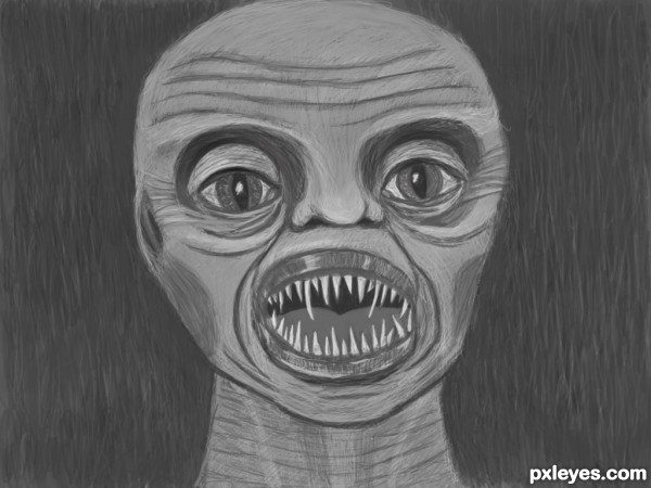
It waits for us all.
Eager to sink it's sharp teeth into us.
Hearing loss,
Hair loss,
Wrinkles,
and gray, crepey skin.
AAAAAhhhhhh! (5 years and 3557 days ago)
It looks really horrible in step 3
really scary
LOL.....he looks tired......anyways nice work.
@anoop yea its really scary@3rd step 
gud job author 
GL
wow, pretty scary, wouldn't want to get bit by one of those = )
A bit flat looking. This needs some shading to give it depth.
Howdie stranger!
If you want to rate this picture or participate in this contest, just:
LOGIN HERE or REGISTER FOR FREE
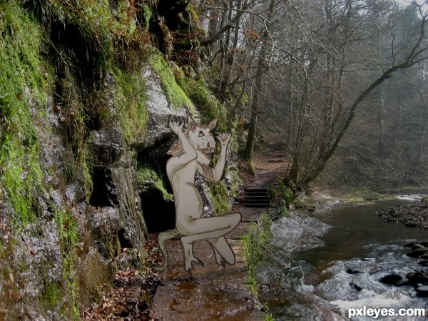
My coloured pencil drawing of an ogre laid onto my photo of Gelt Wood in Cumbria (5 years and 3576 days ago)
Howdie stranger!
If you want to rate this picture or participate in this contest, just:
LOGIN HERE or REGISTER FOR FREE
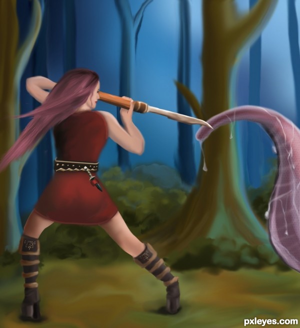
Wanna thank mjranum for the pose reference stock. (5 years and 3590 days ago)
Very nicely done, i love the details!
Really nice, I like the color pallet you've chosen. There is a bit of something leftover under her hair in the background. Other than that superb!
the right hand is backwards on the staff. The thumb should be on the other side of the staff. Unless she is flexable. I also like the colors you picked.
the right hand is backwards on the staff. The thumb should be on the other side of the staff. Unless she is flexable. I also like the colors you picked.
Great work author...watching the size of the creatures palpus,it seams like the warrior is in the serious serious trouble...
beautiful
Howdie stranger!
If you want to rate this picture or participate in this contest, just:
LOGIN HERE or REGISTER FOR FREE
Howdie stranger!
If you want to rate this picture or participate in this contest, just:
LOGIN HERE or REGISTER FOR FREE