withdrawn (5 years and 2820 days ago)

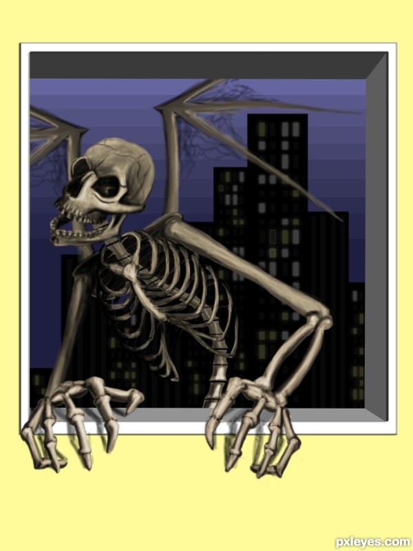
the blue shy was created with the rectangle too-- I started with dark blue then, overlaped that with a blue that was just a bit lighter (5 years and 3382 days ago)
Good concept...throw the silhouetted city out of focus for depth.
very cool entry...work on the skeleton is fantastic...best of luck
Thanks for the comments -- yea the skeleton took for a very long time, multiple re-do's I'm almost happy with the results 
Congrats on 2nd, James.
"...I'm almost happy with the results." lol I know what you mean there. But you did an excellent job on it. I especially like the cob webby stuff in the wing struts (is that what they're called?) That was a unique touch. Great job! I'm looking forward to more of your entries. 
Thank you IDt8r, I still trying tying to get past the learning curve of photoshop - if you noticed some of my other entries. Thank you for the encouragement, it does mean alot to me 
Nice Job Congrats
Howdie stranger!
If you want to rate this picture or participate in this contest, just:
LOGIN HERE or REGISTER FOR FREE
got an SBS author?
This isn't a digital drawing and it isn't your work: http://doodleaday.wordpress.com/2011/01/28/doodle-713-secret-service/
I don't like when people upload a picture which is not made by them self.
What's the point?
This homepage is about showing OUR talent and learn/get inspiration from each other and not about the winning.
wow! lol busted DA!
so when someone uploads their artwork,moderator your job is to do some research on them and see if their work can be found on the net to prove their work is original.Seriously you guys are so hard-working!
Howdie stranger!
If you want to rate this picture or participate in this contest, just:
LOGIN HERE or REGISTER FOR FREE