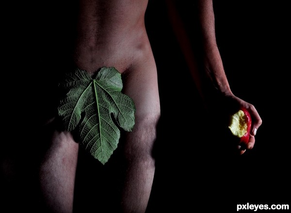
This is the new version.
Light is just tooo much IMHO.
The apple,body are surely more visible but it lacks of mystery,divine mood.
It looks more like a flat studio shot than a man in paradise.
Shadows make you imagine what you can't see,that's why i used them in the first version.
Light is just tooo much IMHO.
The apple,body are surely more visible but it lacks of mystery,divine mood.
It looks more like a flat studio shot than a man in paradise.
Shadows make you imagine what you can't see,that's why i used them in the first version.


