(5 years and 3289 days ago)
bear’s question (5 years and 3286 days ago)
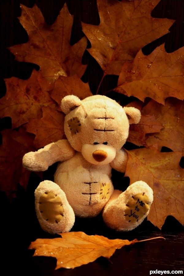
it would have been so cute if you would have had a pile of leaves and he was jumping in them OR he was in a pile of them with his head poking out. This is cute though 
you might want to go over to Help and click on Rules and Guidelines and when there, click on Photography. You find rules there...frames are not allowed. You might want to remove it before it gets pulled.
this teddy is soooo adorable where did you purchase this from?
Very beautifully done! Great idea!
Howdie stranger!
If you want to rate this picture or participate in this contest, just:
LOGIN HERE or REGISTER FOR FREE
(5 years and 3283 days ago)
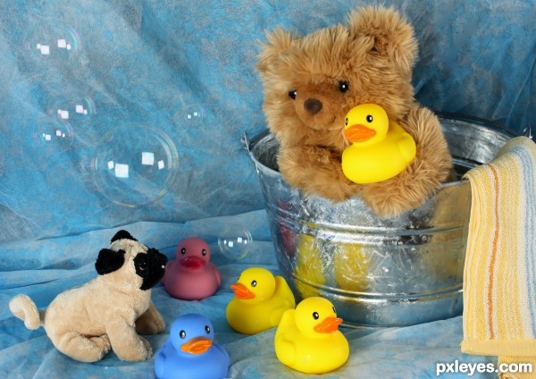
Great shot, love the clarity and the bubble, well done.
Very nice shot
Extra points for bubbles = ) That should be a contest idea, going to suggest it right now = )
Top shot author...its clearly visible that u'r invested lots of work to make this...so high marks from me...best of luck
Howdie stranger!
If you want to rate this picture or participate in this contest, just:
LOGIN HERE or REGISTER FOR FREE
. (5 years and 3289 days ago)
Great funny and creative! Love it 
Excellent idea! Definitely creative.  I'd bump up the shadows just a TINY bit though to give it a little more contrast (looks somewhat washed out). the framing and angle are perfect though! All the best!
Awesome. LOL
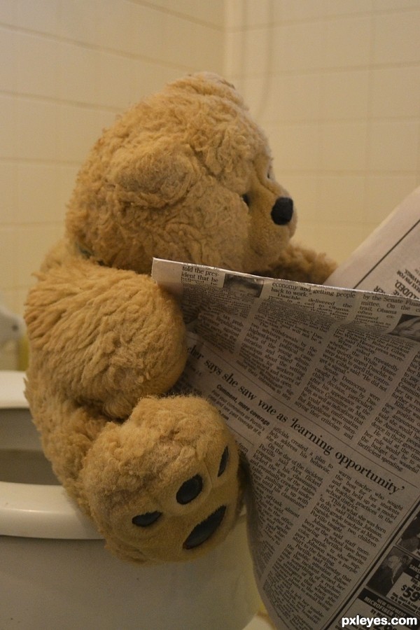
Oh my gosh, I can't believe what I'm seeing! She saw the vote as a "learning opportunity", what is this world coming to, lol.. Great creative funny shot.
So cute!
great idea Author.. !
Like real life..
GL Author..

really really good
hahahahahahahahaha...ultimate humor...well done author
Howdie stranger!
If you want to rate this picture or participate in this contest, just:
LOGIN HERE or REGISTER FOR FREE
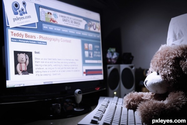
My Bear loves surfing the web and when it heard about the goal of this contest ... it wanted to see if it could find some friends.
:-) (5 years and 3283 days ago)
super cool shot author...best of luck
erathion, can i ask you why do you comment the same thing for the whole entries? You are a talented user, if you like something i think you could write down why do you prefer that work.
Thanks erathion! 
And trialboj...you questioned the erathion but I would like to know...did you like my photo?

Nice idea, but ti would be improved if you used some white paper to reflect some light onto the back and side of the bear, and then darkened the whole image a little.
Thank you friiskiwi!
I did the same photo with the bedroom light on and was more clear but I liked this more because it seems that it is into the early hours surfing the web.

Wonderful concept! So did he find any friends?? 
lool...he found many creative and cute friends =^.^=
Thanks rbsgrl !!

The idea was ok, a little bit similar with mine's, but this is another perception. With this background the whole picture seems a little bit amateur, You should use a dark sheet, in the right side of the monitor, for background, to felt the artistic way of this picture.
Hi trialboj, I would like to see your photo...could you send me the link? Because I looked in many contests and found no similar.
I could have done this way but for me artistic is try to get as close to real as possible and with the black background it would give the impression that the photo was made ​​in studio.
Thank you for de comment! 
Excellent work, author. Lighting a shot like this can be very tricky and you did a great job (although Friiskiwi did give a great tip). The purpose of this contest is to show a teddy bear "anthropomorphized"...that is, given traits to make it appear as if it is alive. I think that your choice to go with a typical bedroom wall for your backdrop really hammers this fact in and was a wise decision. There would have been nothing WRONG with doing a low key black background...I just think this looks better.  All the best!
P.S., I actually lol'd when scrolling through the hi res and I suddenly came across Eve. 
I think both the lighting and background work for this shot. It does look like he's surfing late night
lol = )
I love this image, very cute, lighting scheme really works. If there is a contest about me, I'll be like teddy bear lol. And interestingly, I found Eve in front of the monitor, I like this character.
To magicsteve, thank you very much. I love the movie Wall-e so I put a miniature of him and Eve to take part. 
To kyricom, thank you very much ... that was my intention ... he stay up late on the Internet...lol 
To Emik, lol...glad you liked it...
To langstrum, lol ...thanks... lol...he was a little dark but if you look next to Eve you will find Wall-e. 
Any way...thank you so much for the comments...means a lot to me!!!! 
is cute....lol
Thanks petersheep!!

Howdie stranger!
If you want to rate this picture or participate in this contest, just:
LOGIN HERE or REGISTER FOR FREE
Photography and photoshop contests
We are a community of people with
a passion for photography, graphics and art in general.
Every day new photoshop
and photography contests are posted to compete in. We also have one weekly drawing contest
and one weekly 3D contest!
Participation is 100% free!
Just
register and get
started!
Good luck!
© 2015 Pxleyes.com. All rights reserved.

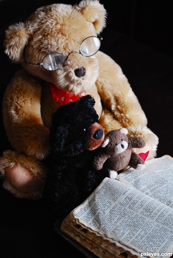
Great lighting and the angle is very nice. Only problem I see is the reflection of your studio in the bear's glasses. In the future to avoid this you can either adjust your light or, if you're lazy like me, simply take the lenses out of the frames. I learned that trick from the photographer who took my senior photos many, many years ago.
Still, your scene is awesome and it really paints a nice story. Kind of reminds me of a Hallmark card. :P Hope that helps! All the best!
Thanks magicsteve for the great tips! I shot it next to a window and it definately caused a glare. I will try and reshoot tomorrow and hopefully get a better effect with the glasses!
While taking school pictures, I learned that if you bring your light up about a foot or so, it helps with glare. Sometimes if you tilt the subjects head slightly down or to the side (only a touch) that helps too. But since you are using natural light, you may have to adjust the scene a bunch to get it right. Either way, I love this photo and the setup!
Thankyou Kellie
cool shot...the old one look so wise...GL author
nice light
Howdie stranger!
If you want to rate this picture or participate in this contest, just:
LOGIN HERE or REGISTER FOR FREE