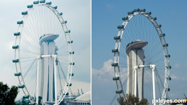
I snapped the one on the left with my husbands point and shoot in November from a taxi.
When back on the same motorway in July, I was ready, and waiting for this view to come up, using my own camera this time. (5 years and 3118 days ago)
Thanks for your comment. ummmm... neither one is Photoshop. The one on the left is an old shot, and the one on the right is the one I "redid" to try and make better. They were put together to make a diptych, but otherwise nothing was done beyond normal Photo rules
Author, yeah.... about that - I've mixed up the two contests!!! ) I was convinced this were for the photo duplicates contest!! Sorry for the confusion!!
ps> i have got to stop talking while packing - nothing good ever comes out of me socializing while busy!!
I have to say that I like the overall look of the first/original photo better. the surroundings are more natural in the redone one but the lighting isn't as good in my opinion. Great to see someone got this started though!
author says:
Well, the second one is natural sun light - one of the things I like about it... Also, I think the blood looks a little more realistic on the outdoor one. But, to each his own. Thanks for your comment.
I've always preferred outdoor, natural settings to 'studio' work. The second shot is nice, since, if one were actually there, it would be what you would see...my only suggestion for the second shot would be to have done a bit of a lower-angle shot
author says:
Thanks for your comment. I took a zillion shots from a bunch of different angles, but settled on this one both because I like the shadows from the fingers, you could see a bit more of the blood, and it was the approximate height of an adult looking down on the situation.
I like the second one better, although there's not much more to see, the ground tells the story. In the first image, backgournd is a black cloth, in the second it's natural ground. And that gives it the realistic look, like it was Jesus hand just nailed there before they're errecting the cross. Much better.
Howdie stranger! If you want to rate this picture or participate in this contest, just:
These are both nice, but I'm not sure I see any huge difference, or "improvement." Both have musician (one playing, one packing) and both have blurred people going by (one on left, one on right)
Howdie stranger! If you want to rate this picture or participate in this contest, just:
I think the noise control was much better in the second one and showing the building in its entiriety or however you spell that word is much better as well as the color control. I do like however the mid-tones and angle of the first one.
Howdie stranger! If you want to rate this picture or participate in this contest, just:
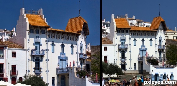
Better angle this time around, as well as color and depth. Nice job!
Thanks, both taking from moving cars, so a bit of a challenge. First one was a lucky shot, 2nd one was a little more planned.
Very good from a moving car
Don't click and drive!!! hehehehe
Great job author 
Howdie stranger!
If you want to rate this picture or participate in this contest, just:
LOGIN HERE or REGISTER FOR FREE