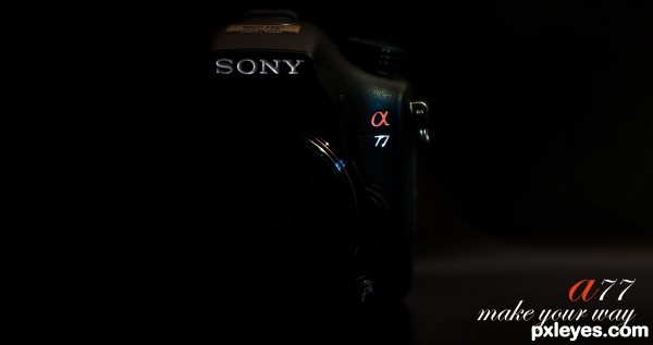
Sony a77 (5 years and 3074 days ago)

(5 years and 3075 days ago)
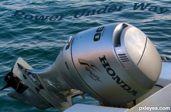
The tagline blends into the water too much, making it somewhat hard to read. If you adjust the color so it matches the outboard, it will be a bit more dynamic.
Howdie stranger!
If you want to rate this picture or participate in this contest, just:
LOGIN HERE or REGISTER FOR FREE

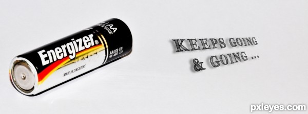
Keeps going & going ... (5 years and 3072 days ago)
Not very original for a tagline...
what do you mean ?
Howdie stranger!
If you want to rate this picture or participate in this contest, just:
LOGIN HERE or REGISTER FOR FREE

(5 years and 3077 days ago)
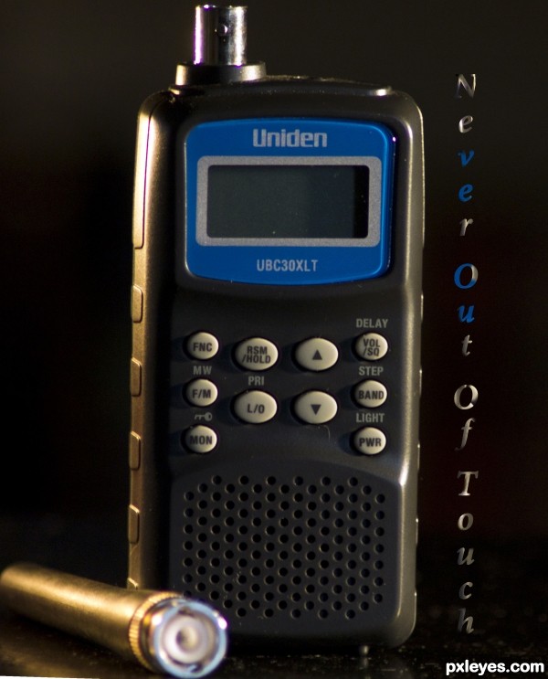
The font seems "out of touch" with the rest of the image...
Most kind of you, MossyB. I honestly can't thank you enough! Keep up the good work! I mean it's ok with comments, but then if they are constructive, helping authors to make amends to entries that they are amendable and/or off topic, otherwise we can always either vote low, or ignore altogether an entry that it is not to our liking- end of story.
I think the lighting has introduced some chromatic abberation (purple finging) on the left hand side of the image (though my home PC is broken and a bit hard to see properly on my uncalibrated work machine). I think this may have been better with the aerial on the 2 way radio as without it, you will definitely be out of touch - perhaps even a little more 'breathing space top and bottom of the subject.
Howdie stranger!
If you want to rate this picture or participate in this contest, just:
LOGIN HERE or REGISTER FOR FREE
Photography and photoshop contests
We are a community of people with
a passion for photography, graphics and art in general.
Every day new photoshop
and photography contests are posted to compete in. We also have one weekly drawing contest
and one weekly 3D contest!
Participation is 100% free!
Just
register and get
started!
Good luck!
© 2015 Pxleyes.com. All rights reserved.

The product is way to dark IMO, logo looks great, but if you are trying to sell a product, surely you would show it.
I think exactly that ist he exciting turn about it...
this is making the customer curious.
every want to see more of the product ...
( i hope my english is not to bad.. ^^)
Too much negative (empty) space, and few clients want their product almost impossible to see. The tagline, "make your way," combined with so much dark, conveys the impression of stumbling around in the dark, and the lack of a visible "guiding light," in this case, the camera, will not make the customer curious. They will instead be drawn to camera ads that show them what they will get if they buy the product...
To make the customer curious, you need to do more than just hide the product. Competition is seldom a game of Hide and Seek.
Thank you for serving feedback.

was probably too preoccupied with my idea ..
i will keep your tips in mind by shootin the next pics..
I like the photo. And I think it would have been great in one of the negative space themes, but I'm not sure a company would want it so difficult to see their product
Howdie stranger!
If you want to rate this picture or participate in this contest, just:
LOGIN HERE or REGISTER FOR FREE