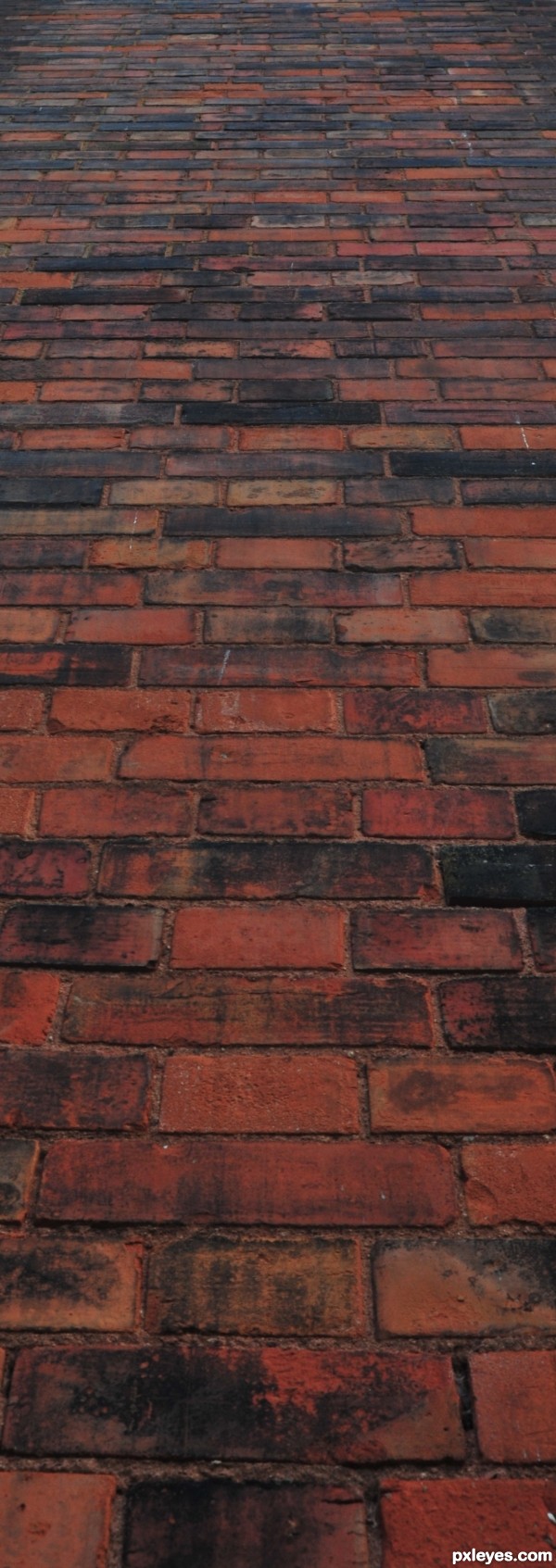
Entry replaced with this closer view. 29 Sep. With apologies to those who kindly voted on the previous image. (5 years and 3496 days ago)
Almost there...  by karaflazz 8399 views - final score: 61.7% | woven mesh  by rblewandowski 12183 views - final score: 61.5% | Razored  by jawshoewhah 7210 views - final score: 60.5% |
Linkage 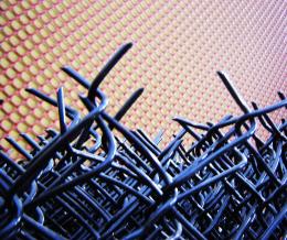 by cocor 7550 views - final score: 60.4% | Rug scape  by Jim61 8621 views - final score: 60.2% | Ship's Rope 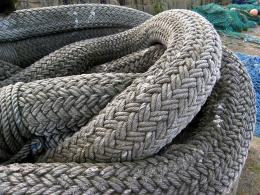 by jeaniblog 12182 views - final score: 59.3% |
Grilledelusional 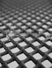 by jawshoewhah 2882 views - final score: 58.9% | Knitter's Need 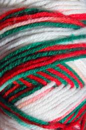 by jawshoewhah 3387 views - final score: 58.3% | Basket 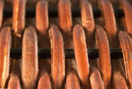 by friiskiwi 3256 views - final score: 58.1% |
ooooh Color! 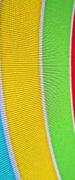 by Glam0urGirl2007 3784 views - final score: 57.9% | lighted basket 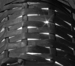 by roon 3589 views - final score: 57.7% | old house 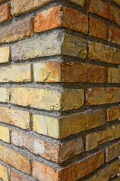 by decazuc 3388 views - final score: 57.1% |
Purple Fingers 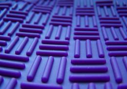 by Jim61 3765 views - final score: 56.9% | Chain  by jeaniblog 3828 views - final score: 56.7% | Found in my bathroom 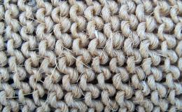 by jerostone 3449 views - final score: 56.7% |
Sunhat 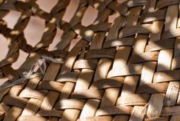 by friiskiwi 2834 views - final score: 56.4% | colorful  by roon 2558 views - final score: 56.2% | Pattern  by Karol 3462 views - final score: 56.1% |
Coloured 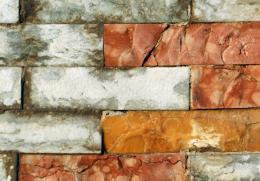 by patty 2869 views - final score: 56.1% | designer texture 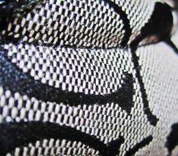 by Glam0urGirl2007 6843 views - final score: 55.9% | Water chrome 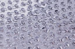 by pioan 4830 views - final score: 55.9% |
Brickin' it  by Harrierman 3414 views - final score: 55.6% | Button 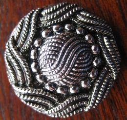 by Seymour 2955 views - final score: 55.6% | tiled pole 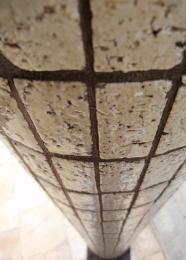 by gustimusprime 4442 views - final score: 55.4% |
Tapestry 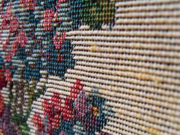 by k5683 7896 views - final score: 55.4% | Fixed 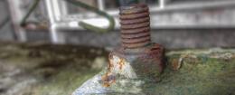 by Lamantine 3301 views - final score: 54.9% | glass 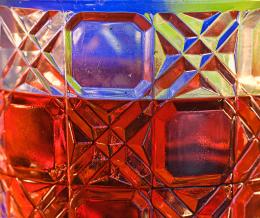 by friiskiwi 2707 views - final score: 54.8% |
golden texture... 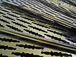 by Glam0urGirl2007 4409 views - final score: 54.6% | Paint  by Lamantine 2675 views - final score: 54.4% | Warp & Weft  by jeaniblog 4871 views - final score: 54.2% |
sydney opera house  by gustimusprime 5205 views - final score: 54.2% | Close to home  by MnMCarta 11541 views - final score: 53.8% | Frog skin 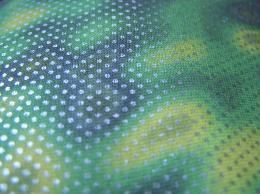 by Jim61 10545 views - final score: 53.7% |
Barbed wire 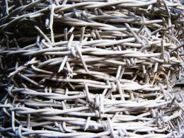 by cocor 6957 views - final score: 53.6% | Guess 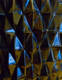 by k5683 3224 views - final score: 52.5% | Wood 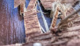 by Lamantine 2180 views - final score: 51% |
focused on in focus 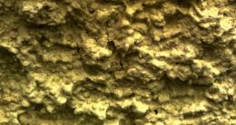 by deus 4899 views - final score: 50.8% | Wheat 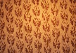 by frelbow 2400 views - final score: 50.7% |
Howdie Guest!
You need to be logged in to rate this entry and participate in the contests!
LOGIN HERE or REGISTER FOR FREE
It seems like you could have got closer.
"This contest is about structures. Not buildings, but closeup shots of the material that is used to build something!"
not a close up
@ creative frredom. If you have an issue with an entry, please use the red flag system, that is what it is there for. Stating 'not a close up' is a red flag issue, and should be done that way, not in the comments box as you have here and elsewhere.
not a closeup
Above comments apply to the original image, which has been changed to one which is closer-up.
It's better and it's a close up now, but it's a little OOF. It's a shame you could not have created more of a depth of field by focusing in on two or three bricks in the wall with a defocused effect more one the ones farther away. Maybe something you might want to work on.
Howdie stranger!
If you want to rate this picture or participate in this contest, just:
LOGIN HERE or REGISTER FOR FREE