(5 years and 3455 days ago)
the wait  by craigers 28077 views - final score: 61.8% | invert  by roon 24997 views - final score: 59.4% | white dress on chair  by toztone 28066 views - final score: 59.3% |
Midnight Finery 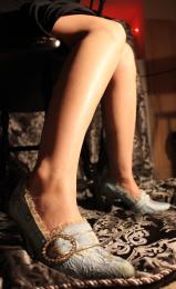 by fullrotation13 31416 views - final score: 58.6% | lady on chair 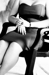 by toztone 25389 views - final score: 58.1% | sit 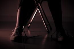 by gplazi 4429 views - final score: 57.8% |
*** 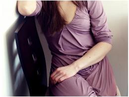 by Rad-Vila 2830 views - final score: 57.7% | - 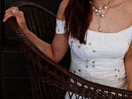 by Rad-Vila 3298 views - final score: 57.4% | Despair 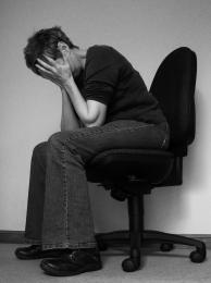 by jeaniblog 7319 views - final score: 57.2% |
just legs. 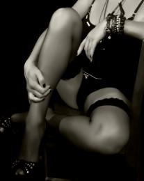 by adeincyprus 9566 views - final score: 56.1% | Depressed 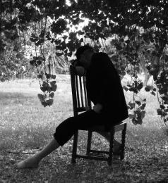 by Andrewm 6856 views - final score: 55.6% | Sitting in the Lounging Chair 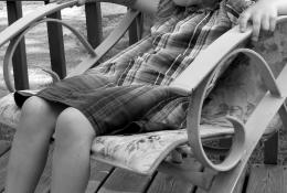 by athousandwords 3926 views - final score: 54.6% |
needs tractor 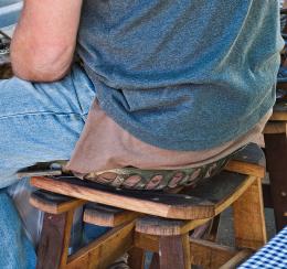 by friiskiwi 3549 views - final score: 54.3% | Whatever works for you... 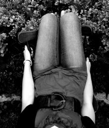 by MnMCarta 4086 views - final score: 53.7% | Water Chair 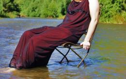 by smokebigbird 4209 views - final score: 52.8% |
Hair Censorship 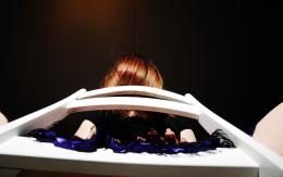 by Shikyo 4048 views - final score: 52.6% | black chair 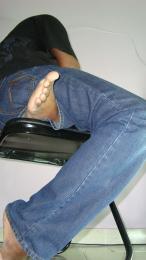 by sanjugs 3180 views - final score: 52% | Cousin It 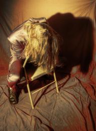 by jawshoewhah 3234 views - final score: 51.8% |
Hang Man 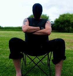 by Andrewm 4161 views - final score: 51.2% | blue  by roon 2659 views - final score: 51.1% | sleeping  by sanjugs 3143 views - final score: 49.2% |
Howdie Guest!
You need to be logged in to rate this entry and participate in the contests!
LOGIN HERE or REGISTER FOR FREE
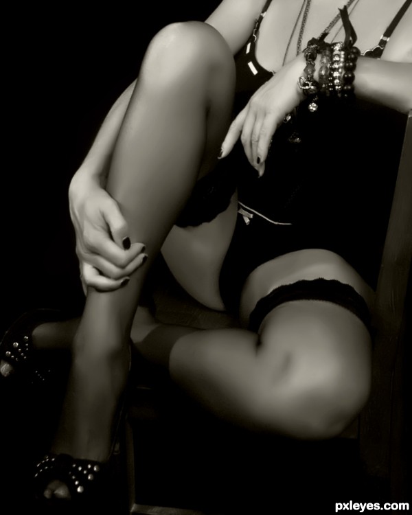
Great glamour shot, but I see no sing of a chair, she could be sitting on the floor or a couch.
I have to agree with friiskiwi. I cannot see a chair either.
gotta agree
Yeah, same here. She looks like's she's sitting on the floor. It's a great shot but there's no chair.
Awesome shot looks great, but uh know, I agree with the others.
trust me, the chair is there.......it is just the gausian blur, and the sepia filter have taken it out. The original to this is black and white, and the chair is quite obvious, but I liked this image more...............changed it though, so you can see the chair.
I don't deny it doesn't look better with the chair being "invisible". It's just that the contest is about a chair and a person being in the picture. So if you take the chair out, even though technically speaking it's still there but not visible, it doesn't quite fit the theme anymore.
And yes, I like the look of it even with the chair in there.
This photo is just as nice and it's on theme now. I like it! GL!
GL!
Excelent shot author! The b&w was a good touch but id have to agree that it would help to see more chair
i saw the chair, Now
Very heavily photoshopped. I appreciate creative and artistic uses of the female body, but this is very overtly sexual. Personally, I think it's unfortunate that we live in a society so drawn to that.
considering it's supposed to be about a chair, this looks very centered around everything but that!
..............As long as part of the person and the chair is in the photo and you can tell they are sitting in the chair, without their face showing, it is on theme.............
As for PS, nothing more than desensitising the image by reducing the clarity.......it has a similar effect to some of the skin filters that are available, and as it applied to the whole image, is legal in this contest.
Overtly sexual!!............what on earth do you mean that............. do you live in a convent?
:lol: well, i do like the shot. however, i feel that your softening has caused it to look a tiny bit oof. i do like the clarity and how it makes the skin look...however, it almost doesn't look realistic.
now..aside from a photography standpoint...i have to be personally picky.
her fingernails needed painted.. not that you notice that right off, but with all the softness in the picture, this ...well, it leaves an unfinished feel to it. A glamour shot should be just that. glamorous. and...chipped up week old fingernail polish isn't glamorous. the bracelets are a bit too much, making the arm look overly bulky.
i like how you have her seated...however, she looks like she's having an issue balancing there. like it was an uncomfortable seating. its all in the body language.
Personally, its one of the better entries. however, i see much that can be improved about it..and since the model is the center of your shot..perhaps focusing on all her little things would do you well.
I see and appreciate your points...........I could have 'touched up' her nails, but then that would have been using PS in a way I am not allowed to do. As it happens, I did not actually notice them when shooting, perhaps my mind was elsewhere... ... and as for her balance, she was quite comfortable, we did a few shots in this position. It is one os a set of pics we did, attempting to emulate the stage show 'Cabaret'.
I see a nice image and the chair also. Great job author..
For what it's worth, I think it's an excellent theme match and I kind of like the soft effect. You did a great job keeping the focus on the contest theme, staying within the guidelines while creating a very artistic entry. I will not be surprised to see this place. GL!
Howdie stranger!
If you want to rate this picture or participate in this contest, just:
LOGIN HERE or REGISTER FOR FREE