(5 years and 3252 days ago)
Anderson's Primary School 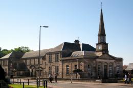 by jeaniblog 9095 views - final score: 64.4% | No More Pencils, No More Books  by magicsteve 8215 views - final score: 64.3% | Burghead Primary 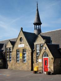 by jeaniblog 6716 views - final score: 63.3% |
ready for class 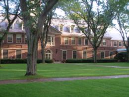 by happyme27 7518 views - final score: 63.2% | One room schoolhouse 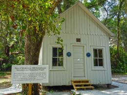 by Remsphoto 8248 views - final score: 62.3% | School's Out... Forever 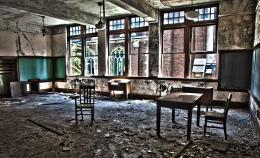 by locksmagic 5252 views - final score: 62.1% |
Lining up  by friiskiwi 3872 views - final score: 62% | Pit School 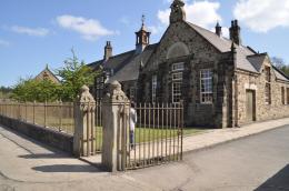 by gibbo192 5310 views - final score: 61.9% | Left To Rot  by Lamantine 3263 views - final score: 61.7% |
College 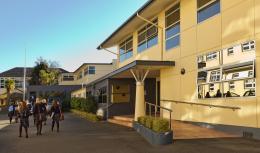 by friiskiwi 2617 views - final score: 61% | class room  by friiskiwi 4409 views - final score: 60.6% | Apple A Day 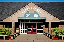 by k5683 3337 views - final score: 60.2% |
Anne E West 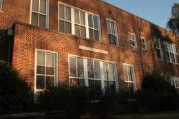 by jbillitteri 4510 views - final score: 59.7% | nameless 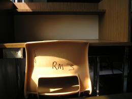 by tytylion 2852 views - final score: 58.2% | Corridor 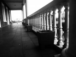 by Lamantine 2815 views - final score: 57.9% |
Grunge School 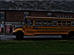 by tytylion 7717 views - final score: 57.4% | Principal sign 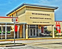 by Remsphoto 4099 views - final score: 56.5% | nameless 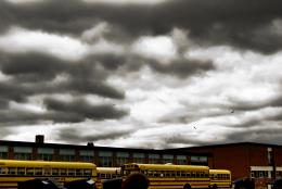 by tytylion 1933 views - final score: 56.4% |
Howdie Guest!
You need to be logged in to rate this entry and participate in the contests!
LOGIN HERE or REGISTER FOR FREE
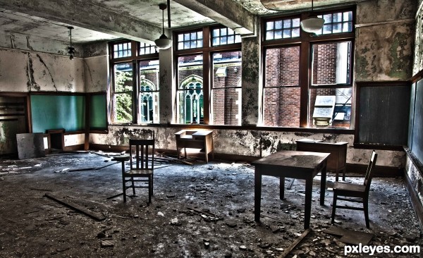
This would be great if the filter weren't so strong--it looks a little tacky. Try to use the original, or at least a less edited version
the idea is great though! very strong message!
I doubt a "filter" was used. This is a classic example of HDR. There are many kinds of HDR. I like it. I think it fits the abandoned building.
yep, have to agree with you there Capt'............
I think it is a bit too much too. I would tone it down just a hair.
Ok not trying to argue here (everyone is entitled to their own opinions) but what do you feel about this shot is overdone. What exactly are you suggesting that i tone down?
the hdr
Lol thank you dear but what about the HDR? The contrast, clarity, vibrancy, fill light? HDR isn't something that can just be turned up or down each level is adjusted individually. I do value your opinion but I need to know what to fix
I agree..............if you have an issue with a shot, then you need to clarify what needs to be fixed............as you say, hdr is a complicated procedure...........there are many different facets that have to be taken into consideration
well, because I'm not an expert at the lighting/shadows/highlights of things it is really hard for me to say exactly what doesn't look right about this. As a whole, I thought that maybe there was too much ghosting but it isn't that because there isn't any that I can see in the HR. I'm thinking that maybe it might be that the highlights are too bright for *lowlights*? (who knows what you call them The dark and the light of the picture has too much difference, they are on too far of a spectrum. GRRRRR, I don't know how to explain it...sorry
did you edit this or have my eyes grown to like it more?
lol, nope didn't touch it
I think I agree the contrast is a bit high
the contrast is WAY to high. I rarely ever like HDR because of how tacky it looks and how over used it is. The detail of the room is enhanced by it, but the highlights int the window are blown out by the increase of contrast. You gain and loose detail in this photo. I applaud you for using true HDR , and I agree that it looks best on abandoned buildings, but the natural highlights in the photo due to direct sunlight are way over done due to the increased contrast form the HDR. If the photo was taken on a cloudy day the contrast wouldn't be a problem, but you need to play around with your curve
Howdie stranger!
If you want to rate this picture or participate in this contest, just:
LOGIN HERE or REGISTER FOR FREE