
(5 years and 3229 days ago)
Bittersweet symphony... 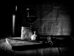 by karaflazz 13125 views - final score: 74.5% | American Elegance  by locksmagic 9308 views - final score: 69% | Next stop?  by kyricom 8568 views - final score: 65.2% |
S.S.Merlot  by Angloaussiekiwi 7816 views - final score: 65% | And then I ate the cheese 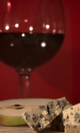 by friiskiwi 10138 views - final score: 64.6% | Flagon of wine  by kathyw 5286 views - final score: 64.2% |
something is wrong  by roon 4804 views - final score: 63.5% | red wine  by kathyw 5123 views - final score: 63.5% | best cheese ever 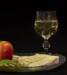 by friiskiwi 5835 views - final score: 62.4% |
Impromptu Lunch 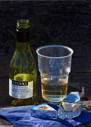 by friiskiwi 3817 views - final score: 61.9% | "Fill er up" 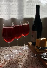 by Angloaussiekiwi 3485 views - final score: 61.7% | What cork screw?  by Remsphoto 5156 views - final score: 61.5% |
first glass 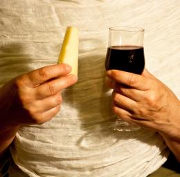 by roon 3771 views - final score: 59.9% | Wine and cheese canyon  by Angloaussiekiwi 5976 views - final score: 56.3% |
Howdie Guest!
You need to be logged in to rate this entry and participate in the contests!
LOGIN HERE or REGISTER FOR FREE
Photography and photoshop contests
We are a community of people with
a passion for photography, graphics and art in general.
Every day new photoshop
and photography contests are posted to compete in. We also have one weekly drawing contest
and one weekly 3D contest!
Participation is 100% free!
Just
register and get
started!
Good luck!
© 2015 Pxleyes.com. All rights reserved.


Since this is a set up (composition) you could try to "arrange" your items a little bit better.
The red background does NOT help the red wine on your glass to show properly.
You should use a white background.
All so the shallow DOF (depth of field) makes the viewer focus on the cheese & not on both of the items.You could use a higher f number to have the maximum DOF.
A wider frame so you could include more of the dish & cheese would be good (it's tooo tight the way it is now).
Thanks, You are most likely right, but this is the effect I was after. But I will consider your suggestions for the next shot. I do appreciate your comments.
Although karaflazz mentions some nice options, I do like this version. For me no problem that the focus is on the cheese, the glass shape and color gives enough indication that we deal with wine. The red background is also fine, with the blurry glass it almost becomes one, but still enough to see what's what and gives the photo something extra to the cheese (like cheese with wine mood, dunno how to explain). Also the close framing with left the wine and right the cheese works well. maaaaybe the front part could do with some more highlights so it repeats with the backparts (light reflection in the glass), but that would be it imo. Good luck!
I actually like this a lot. The darker burgundy is dark enough against the background along with the white speckles from the light.
Howdie stranger!
If you want to rate this picture or participate in this contest, just:
LOGIN HERE or REGISTER FOR FREE