
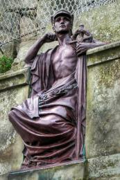
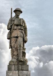
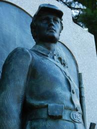
It's a famous war memorial in Melbourne, Australia. The panoramic photo was taken in the mid day, where the sky was clear and blue. Multiple shots were captured and stitched in Photoshop. The challenge was the side lighting where shadow can be distracting or supplementing (5 years and 3238 days ago)

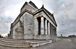


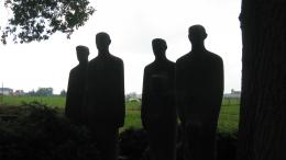


The shadows overall are still too dark, and the sun on the left is too bright, with the values blown out (notice the white glow behind the buildings). I'd crop the sun and the curved portion of the wall on left, and then adjust the levels of the image to make it more "readable," instead of so dark, but that's just me.
this is amazing shot author
love it
high vote and fav from me
just brilliant man
best luck
Perhaps next time take the shots in 'portrait' rather than landscape layout - you will need to take extra shots for the overlap but whne it comes time to stitch them you wont lose the top of the shrine
Thanks for the suggestion Fallinghorse, the shots themselves were taken in the portrait, it's just I don't use DSLR instead I was using Canon powershot with its default lens and there is not room behind me to take the shot from the same angle Shrine of remembrance 2 was waken with DSLR that can cover the whole building that I shot later one (1 year later) after buying DSLR ;p
WOW! Cool picture!
I understand author - I wondered about the difference. A marked improvement too I may add
Howdie stranger!
If you want to rate this picture or participate in this contest, just:
LOGIN HERE or REGISTER FOR FREE