
(5 years and 3108 days ago)
Modern  by WYSIWYG 16457 views - final score: 65.9% | Reading and lounging  by WYSIWYG 16528 views - final score: 65.7% | Old library  by Artifakts 17121 views - final score: 64.8% |
Private Library  by friiskiwi 19753 views - final score: 64.7% | old Library 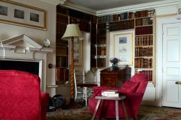 by kathyw 17050 views - final score: 64.6% | Selby Library  by cannons 5554 views - final score: 63.4% |
Shhhhhh  by moonbeam30024 3428 views - final score: 63% | Tight Fit 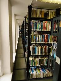 by moonbeam30024 4397 views - final score: 61.9% | Uni Library  by MrsCooper 4146 views - final score: 61.6% |
couple study at library  by wooyuenfoo 7730 views - final score: 61.4% | Old and New  by friiskiwi 3731 views - final score: 61.2% | They're everywhere 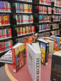 by Remsphoto 3696 views - final score: 60.3% |
Howdie Guest!
You need to be logged in to rate this entry and participate in the contests!
LOGIN HERE or REGISTER FOR FREE
The tilt of the lines, combined with the blurry person, hurts the focal point of your image (library). You can't help the motion blur, but you should straighten the crop for this using the ceiling horizontal as your benchmark, rotating the photo slightly to the right to correct the downward left tilt.
I like the blurry person...
Howdie stranger!
If you want to rate this picture or participate in this contest, just:
LOGIN HERE or REGISTER FOR FREE