(5 years and 2909 days ago)
Red Paint  by Nysoe 9110 views - final score: 69.1% | Orange Crayon  by Juniper 10337 views - final score: 68.3% | Chinese Paint Brush  by Juniper 7909 views - final score: 67% |
the wonder of colors 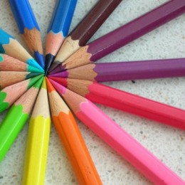 by lexi123 6557 views - final score: 66.5% | Ready to use! 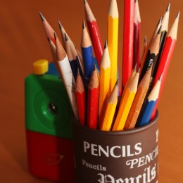 by Majo 7267 views - final score: 64.5% | Charcoal 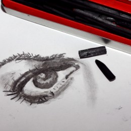 by Majo 4335 views - final score: 64.3% |
On my desk  by asprinta 5473 views - final score: 63.8% | The Look Reloaded 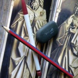 by Athanaric 4137 views - final score: 63.7% | Stacked 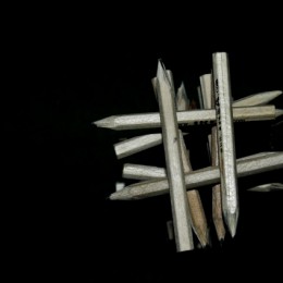 by maggiemay 4865 views - final score: 62.6% |
Paint 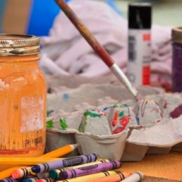 by BeSea 3296 views - final score: 62.2% | keyboard 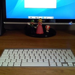 by lexi123 3028 views - final score: 58.2% |
Howdie Guest!
You need to be logged in to rate this entry and participate in the contests!
LOGIN HERE or REGISTER FOR FREE
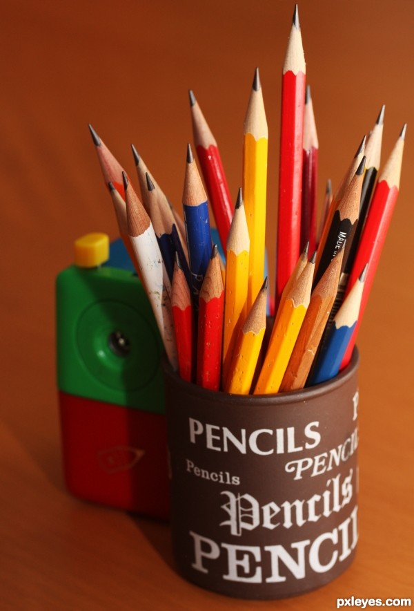
I think that your frame is a little bit "tight"
You could use some more "space" on the top & right of your frame!
very nice, but a little crocked, and I'd love a bit more space at the top.
I have cloned a section but I'm no quite sure if this is allowed in a photography contest so I have put it in the SBS. I agree with you both and think it looks better. If it is allowed I'll swap them!
You are quite right, adding a bit to the photo is not allowed, thanks for your honesty. Guess you just have to leave it as is, and remember next time, to shoot with a little more space around, you can always crop.
Howdie stranger!
If you want to rate this picture or participate in this contest, just:
LOGIN HERE or REGISTER FOR FREE