(5 years and 2864 days ago)
Arlechin Queen  by Mario 11736 views - final score: 76% | Eyelashes  by friiskiwi 7727 views - final score: 72.7% | Makeup Portrait  by robertofanfan 10326 views - final score: 69.5% |
peacock blue 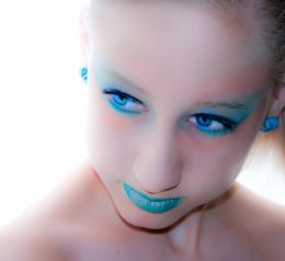 by audreyj 7958 views - final score: 68.7% | green eye shadow 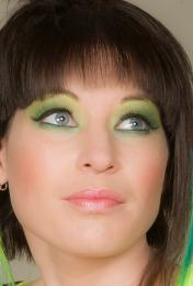 by friiskiwi 13905 views - final score: 67.4% | In the Woods 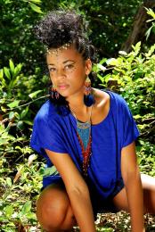 by photogirl723 3435 views - final score: 67.4% |
Black and White  by TwilightMuse 4304 views - final score: 67.3% | Sun Worship 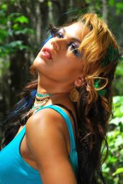 by photogirl723 5291 views - final score: 66.6% | Tiger boy. 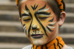 by Clinge 6463 views - final score: 65.1% |
up above  by oziipop 7150 views - final score: 64.5% | Balinese Girl 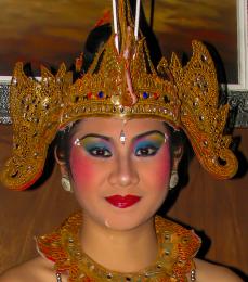 by Juniper 5944 views - final score: 63.5% | Lady Bug Blue 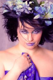 by oziipop 6389 views - final score: 63.1% |
Her Special Day 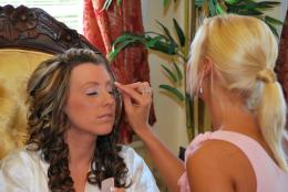 by photogirl723 4932 views - final score: 61.6% | Color Coordinating 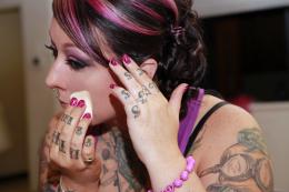 by TwilightMuse 3727 views - final score: 61% | Sugar Girl 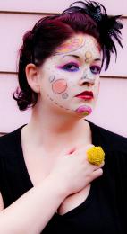 by dorothybv 5127 views - final score: 60.5% |
The Wolf 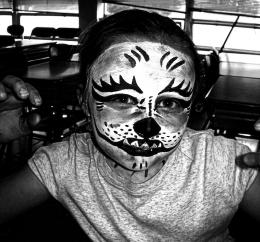 by JoeCacia 2774 views - final score: 58.3% | Parag Marriage 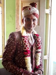 by 6tann 7327 views - final score: 57.5% | Daughter makes up Cousin for school project ;-) 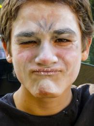 by Clinge 14705 views - final score: 57.2% |
Starting Young 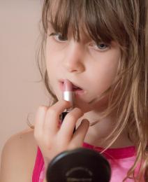 by friiskiwi 4516 views - final score: 57% | Wicked 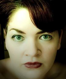 by dorothybv 5727 views - final score: 56.4% | Ready for Ballet  by Juniper 5013 views - final score: 55.4% |
makeover(: 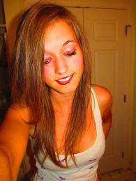 by korsarebecca 2887 views - final score: 54.4% | Dark makeup 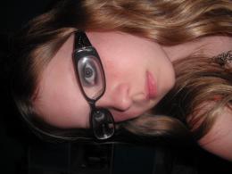 by veganapple 4600 views - final score: 45.5% |
Howdie Guest!
You need to be logged in to rate this entry and participate in the contests!
LOGIN HERE or REGISTER FOR FREE
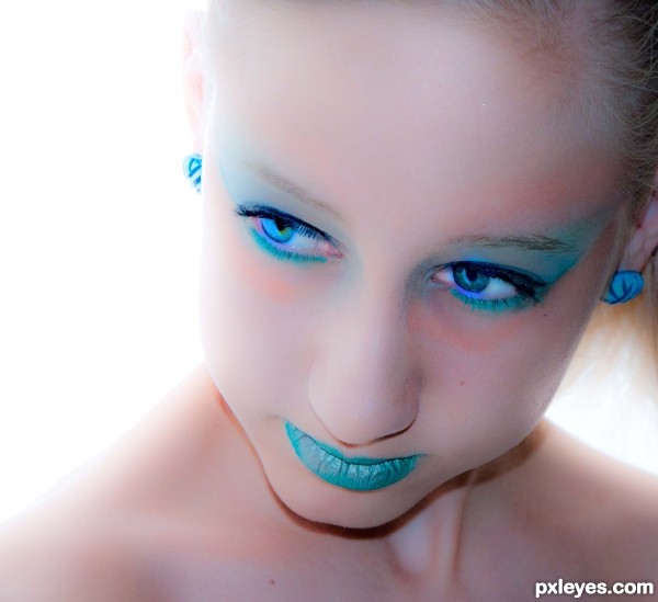
very nice -- contrast between the skin and the blue is great -- wonderful eyes as well
Nice photo, I don't like the editing though. The diffused affect doesn't suit this photo, also, her skin is quite blotchy
By diffused, are you referring to bright white behind ? The only editing done was slight adjustments to saturation, exposure brightening and clarity. Without selective editing, this seemed the only way to soften the leas then perfect teen skin. Suggestions welcome
the saturation blotches the skin, it look like you used a diffused filter on it, but that's probably due to all the other editing. The selective editing would have been better, this editing doesn't flatter the photo at all. The saturation definitely needs to come down.I would increase the contrast as well, and to be honest, you don't need perfect skin to have a perfect photo. I've taken portraits of dirty faces that were beautiful. Perfect skin is just societies ideal
By blotchy I assume u mean the harsh peach on forehead - and I can understand u seeing it that wat but it's actually makeup. The original purpose of this shoot was with peacock feathers and the blush accented the peacock feather. In this particular shot it does look different (as in not as good). Selective editing would be nice but alas against the rules.
@ dem90....if the author chose to do selective editing, yes...it would maybe have made a better image, but! it's aganst the photography rules here and if found by one of us Mods...the image would have been removed...
@ Author, fine image and entry indeed....well done IMHO, and bonus points for choosing to do the 'right' thing and stay away from violating the rules of the site as a trade-off for a slightly 'less-than-perfect' image...As far as I'm concerned...this is a great image, I favor very hi-key and low-key photos, this is a great example of hi-key portrait.
I really like, is elegant
Graze tanto!
Great impact at first sight! Cool image and a huge explosion of saturation. Maybe too much on her lips, but I like it a lot. Good luck author.
thank you
Howdie stranger!
If you want to rate this picture or participate in this contest, just:
LOGIN HERE or REGISTER FOR FREE