(5 years and 2851 days ago)
The mushroom  by mqtrf 19986 views - final score: 71.1% | As you were there  by mqtrf 13038 views - final score: 67.1% | Statue  by friiskiwi 8235 views - final score: 65.4% |
take it 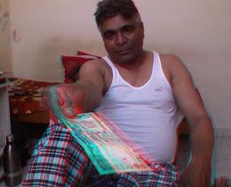 by tweety 6779 views - final score: 65.4% | Jeep 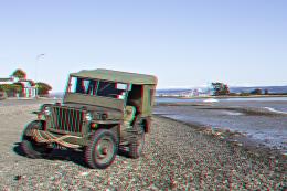 by friiskiwi 6025 views - final score: 65.3% | Lost in the forest 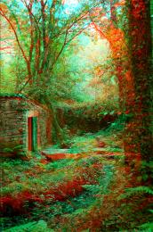 by mqtrf 5361 views - final score: 65.1% |
Howdie Guest!
You need to be logged in to rate this entry and participate in the contests!
LOGIN HERE or REGISTER FOR FREE
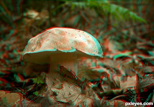
very good anagraph near perfect offset and very little color interferance
very cool, I agree, near perfect...it works very well...nicely done author.
Very nice, good job author.
This is a really beautiful picture, and the 3D feel of it is credible enough.
But I think that if you would have kept the background in focus as well it would have been better.
In a traditional picture the blurred background would work perfectly to focus the attention on the subject, but in an anaglypf you don't need this kind of separation, because the subject sticks right out of the screen, while the background remains in the background. But the viewer should have the opportunity to focus on the background if he wishes to.
That said, i still believe that this is the most (or one of the two most) successful take(s) on the theme.
Good luck.
Howdie stranger!
If you want to rate this picture or participate in this contest, just:
LOGIN HERE or REGISTER FOR FREE