(5 years and 2851 days ago)
Combat Ready  by Wayne Cheah 6966 views - final score: 65.9% | left outside  by kathyw 8628 views - final score: 65.7% | Cutter  by Remsphoto 6765 views - final score: 65.3% |
Honed a lot 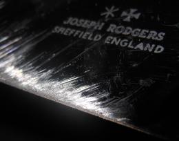 by Remsphoto 4286 views - final score: 65% | Serrated 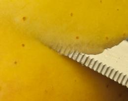 by Remsphoto 3742 views - final score: 64.9% | Grapes 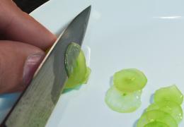 by kyricom 2749 views - final score: 64.8% |
yellow and red 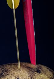 by friiskiwi 3261 views - final score: 64.8% | Cutting 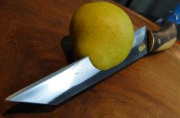 by MarcosSanchez 3236 views - final score: 64.4% | Keep it sharp 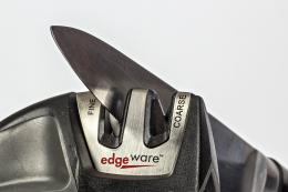 by friiskiwi 3887 views - final score: 64.3% |
Cutting Edge 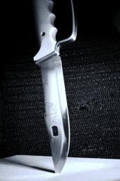 by Wayne Cheah 3478 views - final score: 64.2% | old solinger 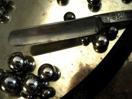 by lincemiope 2792 views - final score: 63.9% | Razor 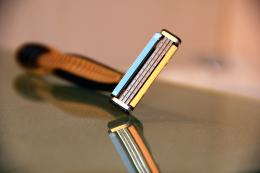 by kb 3044 views - final score: 63.2% |
Head Hunter 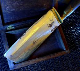 by Wayne Cheah 3271 views - final score: 62.9% | Knife Blades 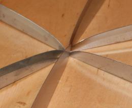 by teecee 3837 views - final score: 62.1% | crocodile  by lincemiope 3856 views - final score: 61.6% |
Axe Blade 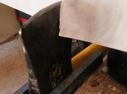 by teecee 4970 views - final score: 60.8% | On The Edge  by knf2750 4001 views - final score: 60.4% | paring 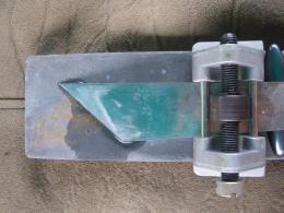 by lincemiope 2238 views - final score: 59.7% |
Cutlery 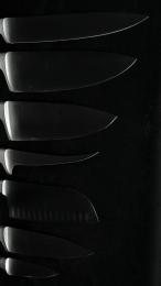 by kyricom 3091 views - final score: 58.7% | Cutting 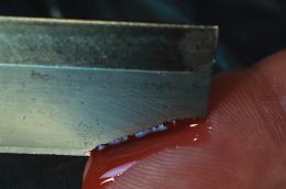 by kyricom 2635 views - final score: 58.3% |
Howdie Guest!
You need to be logged in to rate this entry and participate in the contests!
LOGIN HERE or REGISTER FOR FREE
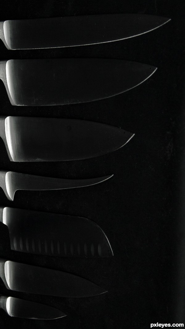
perhaps a little too dark?
Thanks, but I intentionally wanted it dark, with the lighter lines simply "suggesting" the blades.
Great use of light.

You manage to light perfectly a very thin object as a blade!
Fine piece of art I say...
Interesting, but not enough focus on the blades with them merely "suggested." The brightly lit bases of the knives attract more focus.
To each their own, of course. But this is the way I liked it. Need subtlety in life
nice
Howdie stranger!
If you want to rate this picture or participate in this contest, just:
LOGIN HERE or REGISTER FOR FREE