- Camera: NIKON CORPORATION
- Camera model: NIKON D3200
- Exposure time: 1/640
- Aperture: f/5.6
- ISO: 200
(5 years and 776 days ago)
Old tech.  by Heathcliffe 11070 views - final score: 61.5% | The Morning Jog  by Adam773 11143 views - final score: 59.8% | Misty River  by photonut 12974 views - final score: 59.3% |
In the eyes of my cat 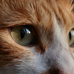 by Denlig 11238 views - final score: 59.2% | When Are the Waves? 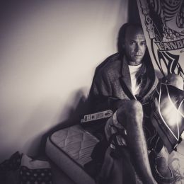 by rturnbow 9491 views - final score: 58.7% | A Pool With A View  by Adam773 3432 views - final score: 58.4% |
Broken Tree  by photonut 3618 views - final score: 58.1% | Garland Factory  by Adam773 1879 views - final score: 58% | Painting The Town Red  by Adam773 2293 views - final score: 57.3% |
The Midas Touch 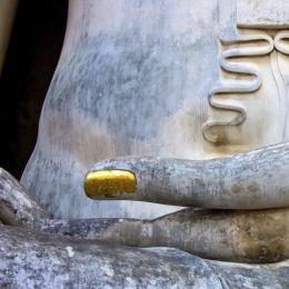 by Adam773 3588 views - final score: 57.1% | Kalkara Festa Malta  by Adam773 2470 views - final score: 56.8% | Stairway To Heaven  by Adam773 2114 views - final score: 55.9% |
Hoar Frost  by kyricom 8816 views - final score: 55.8% | No lobstering today 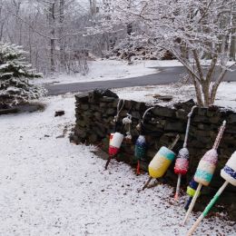 by dhoebeke 1441 views - final score: 54.8% | Wish you were Here 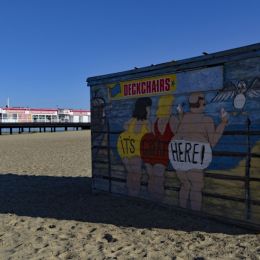 by photonut 3233 views - final score: 54.7% |
Snowy Field 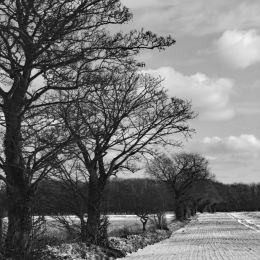 by photonut 3713 views - final score: 54.6% | Posts 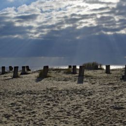 by photonut 3216 views - final score: 54.5% | Entry number 106244  by wooyuenfoo 2368 views - final score: 54.1% |
Sleeping Beauty 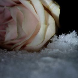 by Ekaterina 1279 views - final score: 53.6% | Abandoned Bicycle  by rturnbow 1485 views - final score: 53% | Nandi Bull and Motorbike  by Adam773 4195 views - final score: 52.9% |
Street Grandma 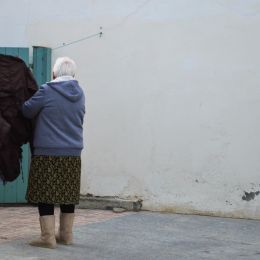 by Antonis 1482 views - final score: 52.5% | Hide and Seek - Novice Division 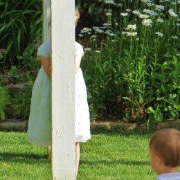 by dhoebeke 1375 views - final score: 52.1% | Into The Unknown  by Adam773 4595 views - final score: 52% |
Entry number 106232 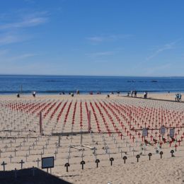 by stofa 2809 views - final score: 51.9% | Colorful houses on the waterfront 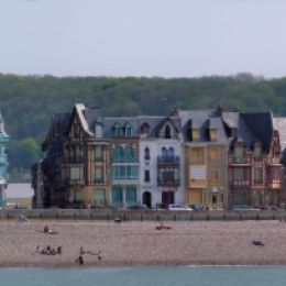 by Denlig 1548 views - final score: 51.7% | Farmer's Field 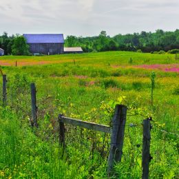 by kyricom 3811 views - final score: 51.4% |
Lost  by kyricom 4344 views - final score: 51% | Windmills Of The Mind  by Adam773 2657 views - final score: 49.9% | Snow Scene 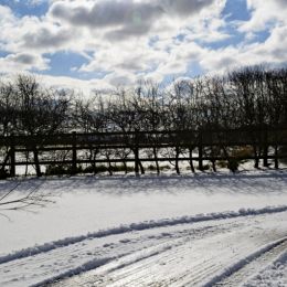 by photonut 3238 views - final score: 49.5% |
Forest Lace 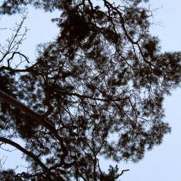 by Ekaterina 1331 views - final score: 46.8% |
Howdie Guest!
You need to be logged in to rate this entry and participate in the contests!
LOGIN HERE or REGISTER FOR FREE
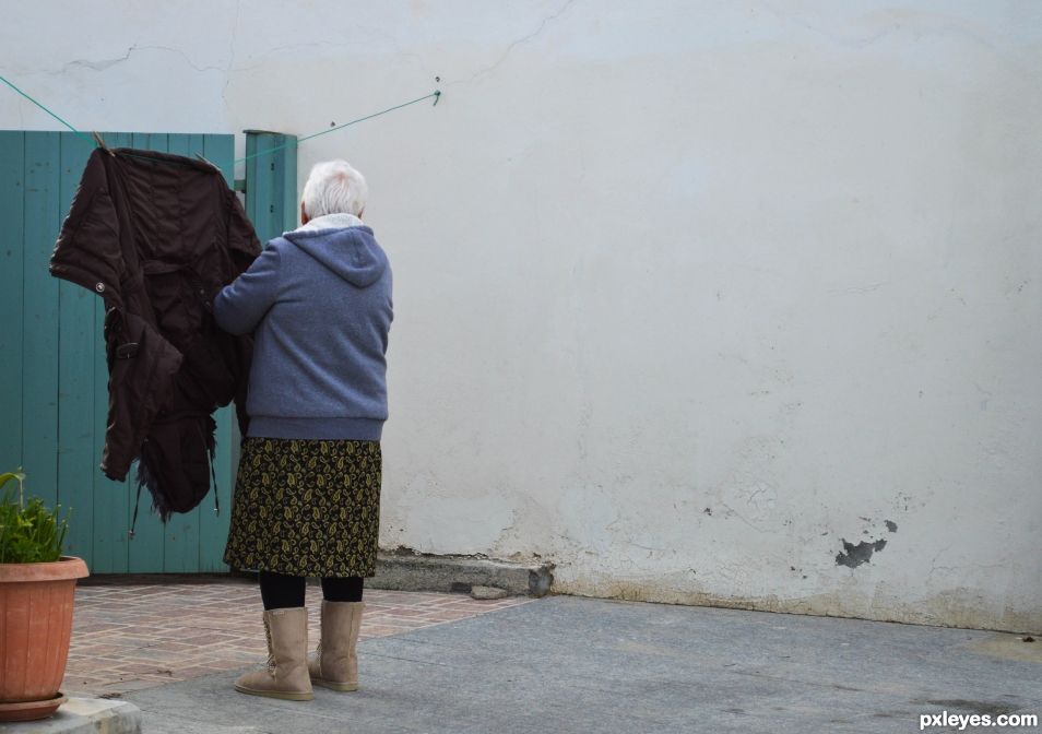
Interesting idea but too much empty space on the right
But who says is wrong to have empty space? In my opinion my picture is composed according to the rule of thirds!
Apart of rule of thirds it should be a balance in the image. Here the view is mostly deviated from your subject by the said 'empty space'... You could have this in the so called minimalism when the subject is so small and the empty space does not disturb the subject.
I could not really explain why, but I feel attracted by this image, and into it, because of this void space. I want to fill this void and look closer. This might not be academic, only a feeling I get. Sometimes the rules are made to be broken
You are totally right. Rules are there to be broken, to our great satisfaction as long as we are not penalised...
However, if I look at your picture I see two! One on the left with a lot of action... full of story telling. And another one on the right side where nothing happens... No story, nothing... Could this be interesting??? To you? What if you change your point of view and try to see it through some other's eyes... Does it stand up???
In photography when you come to broke the rules the only penalty you get is to be not recognized. It hurts, but you learn to what extent the rules are breakable...
i have chosen to leave empty space in the 2/3 of the photo because i see some interesting elements on the left and let the viewers eye fall on the awkward lady with this special way of dressing. On the left there are the colours , there is life your eye goes there!But on the right! you see a white wall , a little damage, so something is happening. This lady is somewhere maybe alone, doing her daily chores in a place where there is mystery. She has only her coat on the rope, she is lonely! Sorry for the long text but apart from following the "rules", I have seen something there!
If I focused only on the lady I think this photo wouldnt be so strong!
I feel less would have been more with this shot. I am not bothered by the negative space for it defines the grandmother or the other half of the image. However, the plantar the green wooden gate,detract, so when I say less is more had they been out , to me the image would have appeared stronger and less cluttered, negative space nothwithstanding.
Howdie stranger!
If you want to rate this picture or participate in this contest, just:
LOGIN HERE or REGISTER FOR FREE