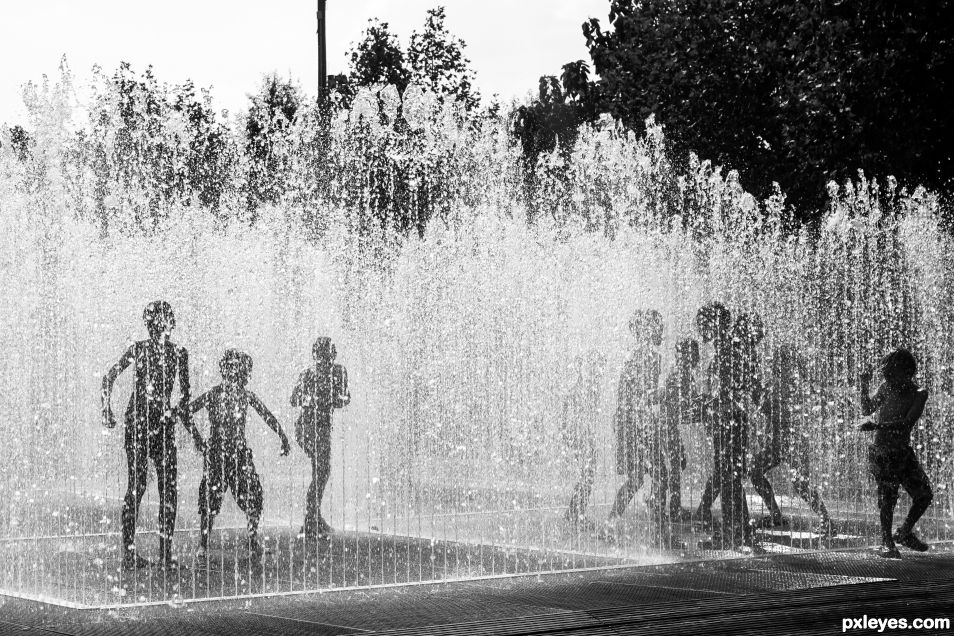
- Camera: SONY
- Camera model: ILCE-6000
- Exposure time: 1/500
- Aperture: f/9.0
- ISO: 100
(5 years and 612 days ago)
H2O Speed  by kyricom 13116 views - final score: 59.9% | My Turn to Paddle  by photonut 11829 views - final score: 57.4% | Brooklyn  by vanDeursen 11658 views - final score: 57% |
Going Fast 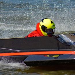 by photonut 11986 views - final score: 54.9% | Dragon Racing 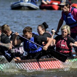 by photonut 11750 views - final score: 54% | Stick Chasing 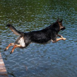 by kyricom 3843 views - final score: 52.9% |
Taxi 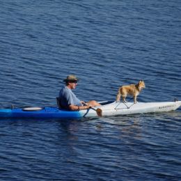 by kyricom 4136 views - final score: 51.2% | Dolce Far Niente 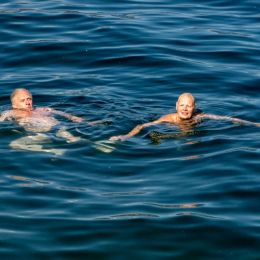 by vanDeursen 1303 views - final score: 50.6% |
Howdie Guest!
You need to be logged in to rate this entry and participate in the contests!
LOGIN HERE or REGISTER FOR FREE
I like this one,works well in a silhouette mode,would crop out that sky though,feel the image would be stronger.
Not sure i agree with photonut in this one. cropping let you loose some fine details, right side especially. No...i would like to say..great entry.
I only would remove the ugly pole (1/3), hahahaha
You have two photos in one here. If you slice down half the page and crop down artistically, keeping the fine details of the 3 silouetted images you have one classy shot.(minus the pole) What you have up splits our visual attention with eyes going left to right to right to left and the power of the image has been lost. Taking this to monochrome was interesting but if the children were wearing brightly coloured bathing suits the colour would have added a bit more visual stimulation and excitement. I like this post and the creativity behind it.
Looks like the kids are having a lot of fun.
I agree about removing the pole.
Howdie stranger!
If you want to rate this picture or participate in this contest, just:
LOGIN HERE or REGISTER FOR FREE