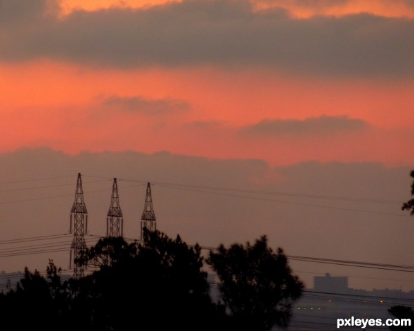
(5 years and 3055 days ago)
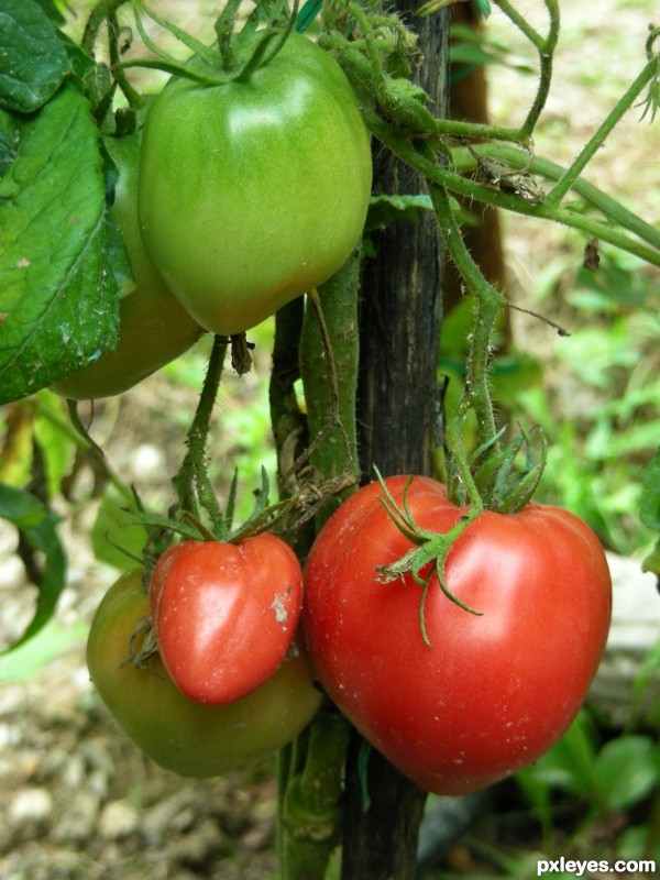
(5 years and 3056 days ago)
lovely photo
Tomatoes? Aren't they a fruit?
I would consider them a vegetable, as you grow then in a vegetable garden.
Tomatoes are technically a fruit... but pretty much everyone considers them a vegetable - they go on salads and stuff. 
Congratulations... like this photo!!
Brava Anna! Congrats! 
Howdie stranger!
If you want to rate this picture or participate in this contest, just:
LOGIN HERE or REGISTER FOR FREE
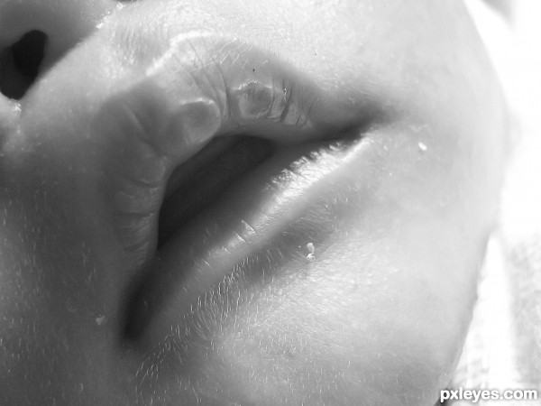
(5 years and 3057 days ago)
sweet
I am pretty sure this is a mouth.
Howdie stranger!
If you want to rate this picture or participate in this contest, just:
LOGIN HERE or REGISTER FOR FREE
(5 years and 3063 days ago)
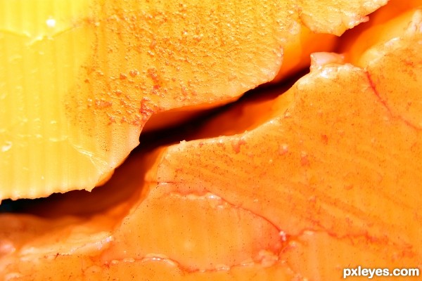
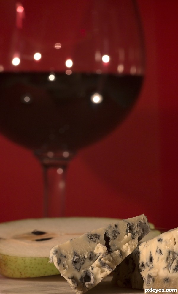
Where's the wine?
If you look at the cracks, it's there. The dusty looking bits are either finings, or with red wines you also get the tannins coming out of suspension. It's a Merlot (red) which the cheese is sitting in. All redness caused by the wine either directly or by reflection.
sorry but I do not see any wine. I see a shadow that's it. 
Howdie stranger!
If you want to rate this picture or participate in this contest, just:
LOGIN HERE or REGISTER FOR FREE
(5 years and 3065 days ago)
Since this is a set up (composition) you could try to "arrange" your items a little bit better.
The red background does NOT help the red wine on your glass to show properly.
You should use a white background.
All so the shallow DOF (depth of field) makes the viewer focus on the cheese & not on both of the items.You could use a higher f number to have the maximum DOF.
A wider frame so you could include more of the dish & cheese would be good (it's tooo tight the way it is now).
Thanks, You are most likely right, but this is the effect I was after. But I will consider your suggestions for the next shot. I do appreciate your comments.
Although karaflazz mentions some nice options, I do like this version. For me no problem that the focus is on the cheese, the glass shape and color gives enough indication that we deal with wine. The red background is also fine, with the blurry glass it almost becomes one, but still enough to see what's what and gives the photo something extra to the cheese (like cheese with wine mood, dunno how to explain). Also the close framing with left the wine and right the cheese works well. maaaaybe the front part could do with some more highlights so it repeats with the backparts (light reflection in the glass), but that would be it imo. Good luck!
I actually like this a lot. The darker burgundy is dark enough against the background along with the white speckles from the light.
Howdie stranger!
If you want to rate this picture or participate in this contest, just:
LOGIN HERE or REGISTER FOR FREE
Howdie stranger!
If you want to rate this picture or participate in this contest, just:
LOGIN HERE or REGISTER FOR FREE