(5 years and 3166 days ago)

(5 years and 3167 days ago)
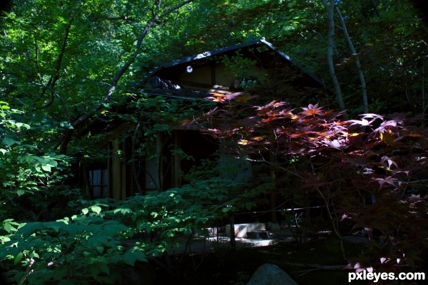
The contrast is a bit too dark, I can barely make out the cottage.
Mossy This whole place was very dark, If you did not know it was there you could walk right by it at about 30 yard away, I am only about 20 yard away when this picture was taken. All the colors were meant to blend with the surroundings.
beautiful author
best luck
Lovely author! Best of luck!
When can I move in?
Howdie stranger!
If you want to rate this picture or participate in this contest, just:
LOGIN HERE or REGISTER FOR FREE

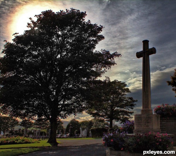
"This cross of sacrifice is one in design and intention with those which have been set up in France and Belgium and other places throughout the world where our dead of the great war are laid to rest"
(3 pics merged to HDR and levels and saturation adjusted) (5 years and 3167 days ago)
It's terribly dark, the monument is hard to make out.
I was looking for a silhouettey effect - but can make it lighter...
It's better now, the base of the monument can be seen. Gives it better depth and mood. Nice improvement!
i like it author best luck
An amazing shot author! Lovely!
Howdie stranger!
If you want to rate this picture or participate in this contest, just:
LOGIN HERE or REGISTER FOR FREE

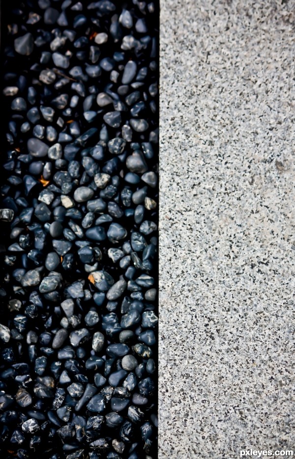
A path in a park (5 years and 3167 days ago)
Too close to the path to see the park...
Wonderful shot! Best of luck!
Howdie stranger!
If you want to rate this picture or participate in this contest, just:
LOGIN HERE or REGISTER FOR FREE

It's a famous war memorial in Melbourne, Australia. The panoramic photo was taken in the mid day, where the sky was clear and blue. Multiple shots were captured and stitched in Photoshop. The challenge was the side lighting where shadow can be distracting or supplementing (5 years and 3167 days ago)
The shadows overall are still too dark, and the sun on the left is too bright, with the values blown out (notice the white glow behind the buildings). I'd crop the sun and the curved portion of the wall on left, and then adjust the levels of the image to make it more "readable," instead of so dark, but that's just me.
this is amazing shot author
love it
high vote and fav from me
just brilliant man
best luck
Perhaps next time take the shots in 'portrait' rather than landscape layout - you will need to take extra shots for the overlap but whne it comes time to stitch them you wont lose the top of the shrine
Thanks for the suggestion Fallinghorse, the shots themselves were taken in the portrait, it's just I don't use DSLR instead I was using Canon powershot with its default lens and there is not room behind me to take the shot from the same angle  Shrine of remembrance 2 was waken with DSLR that can cover the whole building that I shot later one (1 year later) after buying DSLR ;p
WOW! Cool picture!
I understand author - I wondered about the difference. A marked improvement too I may add 
Howdie stranger!
If you want to rate this picture or participate in this contest, just:
LOGIN HERE or REGISTER FOR FREE
How cool!
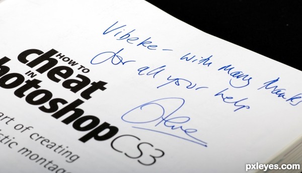
Cheaty cheaty, bang bang, author. Have you seen the film?
Oh lol! I want a cheat sheet as well!
Howdie stranger!
If you want to rate this picture or participate in this contest, just:
LOGIN HERE or REGISTER FOR FREE