(5 years and 3417 days ago)
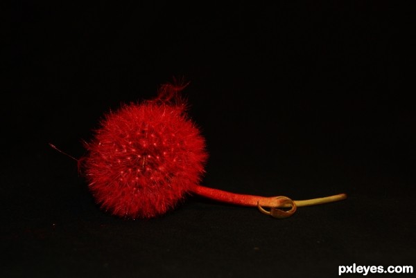
ok after reshooting n the think being half dead, i hope this is better at shot to show what i did, sprayed it with spray paint. (5 years and 3417 days ago)
mmm, nice idea, but there is not much paint here..........just light!....ot imo!
I sprayed it red n used a light at the bottom to light it up, these r normaly white
i can take a shot of it in normal light if that would be better
it would be good if you put this info in the description, as it is not obvious!
Agree w/ Ade....not very obvious that the red is from paint and not just from lighting. I might think about changing the entry to show better the red color from paint and not lighting???
great job. probably the oddest thing to paint. Awesome!
Howdie stranger!
If you want to rate this picture or participate in this contest, just:
LOGIN HERE or REGISTER FOR FREE
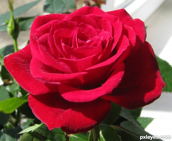
rose (5 years and 3418 days ago)
I love roses... 
Howdie stranger!
If you want to rate this picture or participate in this contest, just:
LOGIN HERE or REGISTER FOR FREE
(5 years and 3420 days ago)
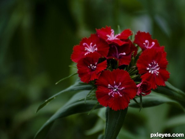
Very nice. Might bump up the brightness just a touch
Good colours, and excellent focus.. really nice image 
ah! thanks muchly! good idea kyricom. I will play with it some tomorrow.
Beautiful ! Nice colors !
Howdie stranger!
If you want to rate this picture or participate in this contest, just:
LOGIN HERE or REGISTER FOR FREE
(5 years and 3421 days ago)
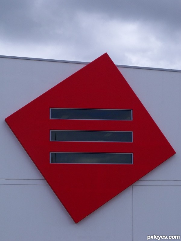
This is very confusing, kinda makes my head swim. Nice find though, it is certainly unique. What is this building author?
This is part of the new headquarters for a community nursing service. About 2 metres to the right of this square is the actual logoed name of the service also brightly coloured.
Well that's neat, does the rest of the building have this type of unique style?
it is a brand new contemporary style building, something of which we have very few in our area. The front of the building is broken into 2 parts by a red "division" area at about the 2/3 point of the front wall area, which ties back to this square. Sad description I know.
Cool capture good luck to you 
Howdie stranger!
If you want to rate this picture or participate in this contest, just:
LOGIN HERE or REGISTER FOR FREE
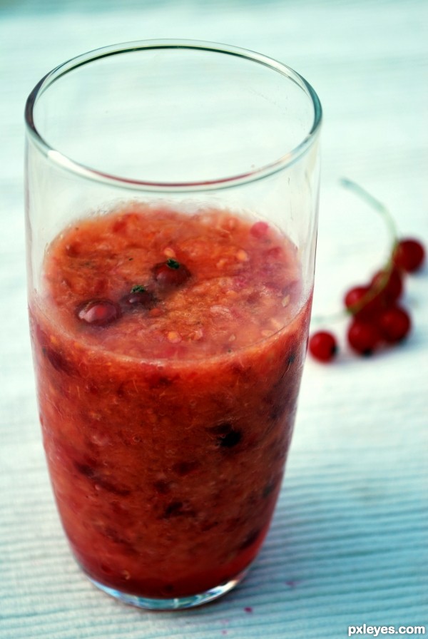
looks yummy
(closeup of just the side of the glass might make a cool abstract)
Howdie stranger!
If you want to rate this picture or participate in this contest, just:
LOGIN HERE or REGISTER FOR FREE