(5 years and 2956 days ago)
(5 years and 2962 days ago)
Howdie stranger!
If you want to rate this picture or participate in this contest, just:
LOGIN HERE or REGISTER FOR FREE

(5 years and 2963 days ago)
Howdie stranger!
If you want to rate this picture or participate in this contest, just:
LOGIN HERE or REGISTER FOR FREE
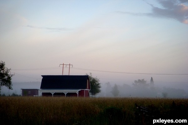
Taken with a Nikon SLR (good ol' film camera!) (5 years and 2966 days ago)
Too dark, with too much dead space at the bottom.
This would be far more visually impressive if you cropped it so that the farmhouse occupied the majority of the picture plane, since the field is so dark, the right hand side so foggy, and the sky somewhat colorless.
I would just crop some of the field, I really like the fog and the blue sky above it.
I cropped it bit. I agree the dark was weighing it down a bit too much. hopefully this is better
yes, that helps
Howdie stranger!
If you want to rate this picture or participate in this contest, just:
LOGIN HERE or REGISTER FOR FREE
(5 years and 2969 days ago)
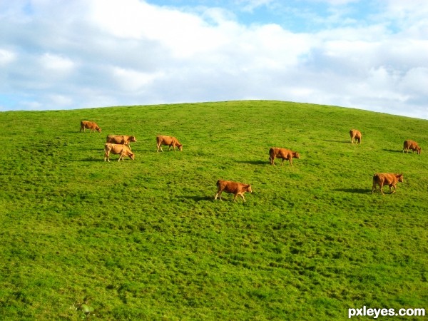
Sometimes, just the name of a photograph can catch the attention of a viewer. I am bad at naming things myself, but I am thinking a different name like "staggered" or something would be better than Red on Green, since I really don't see any red...I only see brown.
It looks very photoshopped to me.
What do you mean, photoshopped???
Very clean picture ! I love that kind of purity that emerges of it.
Howdie stranger!
If you want to rate this picture or participate in this contest, just:
LOGIN HERE or REGISTER FOR FREE
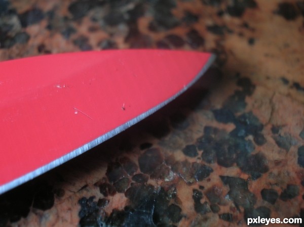
I like how the edge is in contrast to the knife color, but your counter top is pretty busy and takes away a little from your subject. I'd love to see this knife on a solid colored background to accent the edge. Just my opinion. Nice entry author.
Howdie stranger!
If you want to rate this picture or participate in this contest, just:
LOGIN HERE or REGISTER FOR FREE