Canon EOS 600D (5 years and 2890 days ago)

(5 years and 3079 days ago)
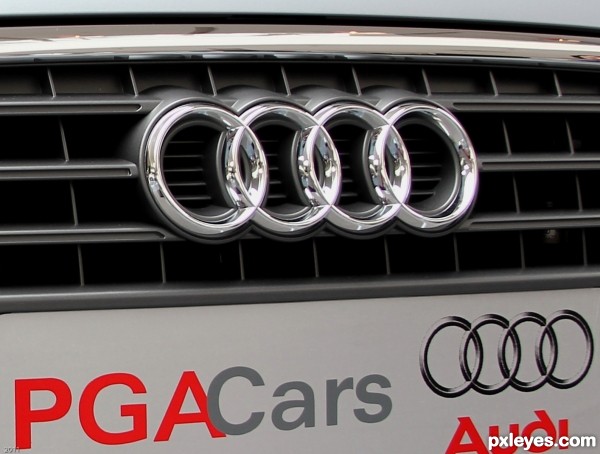
The text at the bottom is distracting from the emblem.
Howdie stranger!
If you want to rate this picture or participate in this contest, just:
LOGIN HERE or REGISTER FOR FREE

(5 years and 3084 days ago)
Howdie stranger!
If you want to rate this picture or participate in this contest, just:
LOGIN HERE or REGISTER FOR FREE

(5 years and 3813 days ago)
Howdie stranger!
If you want to rate this picture or participate in this contest, just:
LOGIN HERE or REGISTER FOR FREE
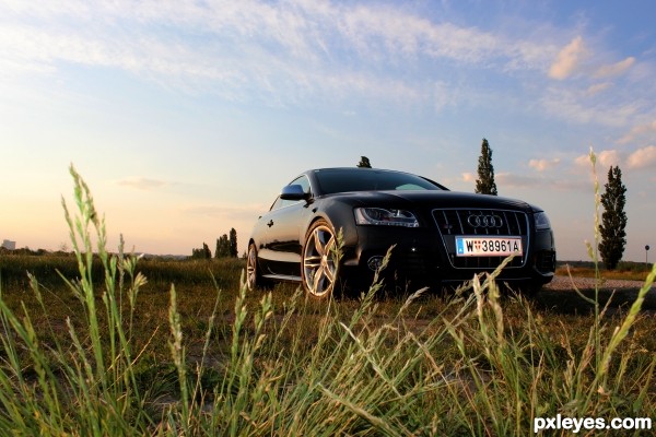
I like the dramatic angle and all the empty space available for text. Unfortunately, the license plate is the dominant element with the grass coming in second so the car rates third. Some desaturating and maybe blurring might be in order to focus attention on the product. [I do question the "you can park in a field" message as a selling point, however.]
Don't lead the photographers astray, we aren't allowed selective blurring.
Thank you very much... i really like the picture, you are right, the license plate ist to dominant because i didn't realise the flash when i took the picture... after i saw the flash i closed it and went on without flash... usually i would "repair" that picture in photoshop but as friiskiwi said... it's not allowed, thats why i only changed the dynamic in the whole picture. but for me, the gras is okay like that... just the license plate is disturbing me =)
thanks for your comment!
What you can do is darken the license plate and grass. If you have photoshop you could use the burn tool. That would draw less attention to them.
I believe the burn tool is a no-no, because it is only working on one area of the entry, not on the total image. I might be wrong.
i think you're right
I admit I don't know all the rules for this contest, but it's naive to think that commercial photographs aren't Photoshopped. If the objective here is to create a photo that could be Photoshopped into a compelling ad, I think this passes the test.
I think you're absolutely right, moreover, in my opinion that small mistakes make the picture nice, sympathetic
5 minutes in photoshop and it would be perfect, but it's already written into the rules, it is not a photomanipulation contest. So I've just reworked the dynamics of the picture.
just like you would see as an ad on a bil board!! nice work
thank you =)
You could just take the license plate off the car for the shot if it was an issue.
Howdie stranger!
If you want to rate this picture or participate in this contest, just:
LOGIN HERE or REGISTER FOR FREE