(5 years and 2889 days ago)

(5 years and 2949 days ago)
Howdie stranger!
If you want to rate this picture or participate in this contest, just:
LOGIN HERE or REGISTER FOR FREE

(5 years and 2982 days ago)
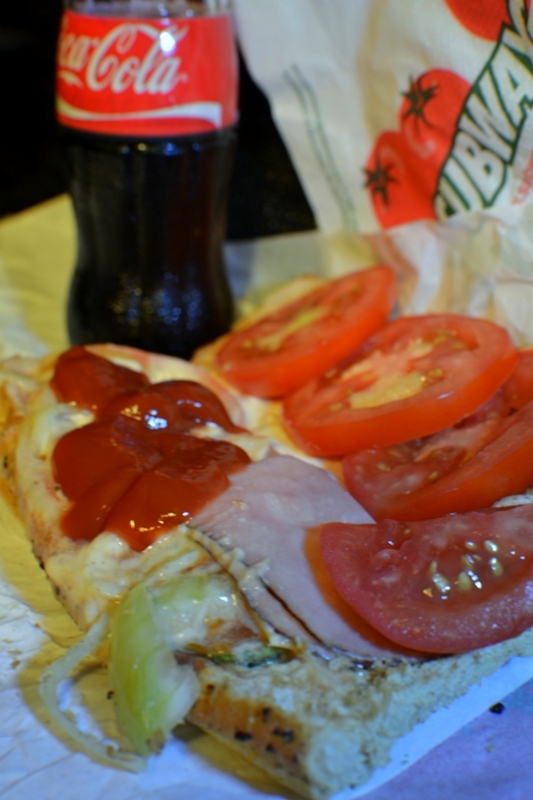
Nice, but the focus is a little soft
I was thinking the focus should be on the nearside ham and tomato and blurred the more obvious commercial products which shouldn't be too prominent here. I was hoping to put people, especially the young, off fast food here. Thanks for your comment. For some reason this contest is not well entered.
Sorry Author, while I understand your reasoning here, Mark is correct, the DOF is so shallow, the entire image seems a bit on the soft side. Perhaps a bit more lighting and distance between the subjects and a tad higher f/stop and you can increase the DOF and bring better attention to where you see the need for it. Having so much of the image OOF just isn't working here IMHO
Thanks for your comments kyricom and itsmymoment. Will do so at the next appropriate contest.
Howdie stranger!
If you want to rate this picture or participate in this contest, just:
LOGIN HERE or REGISTER FOR FREE

(5 years and 3036 days ago)
best one........ all the best author
Howdie stranger!
If you want to rate this picture or participate in this contest, just:
LOGIN HERE or REGISTER FOR FREE

(5 years and 3076 days ago)
This is very appealing to me. Great job 
Howdie stranger!
If you want to rate this picture or participate in this contest, just:
LOGIN HERE or REGISTER FOR FREE
pretty impressive horns
a very decent attitude
Wonderful composition, with great contrast, color, and balance. Looks like a professional "portrait." Great job!
Howdie stranger!
If you want to rate this picture or participate in this contest, just:
LOGIN HERE or REGISTER FOR FREE