Photography Pictures: Blood


results 1 - 5 of 12

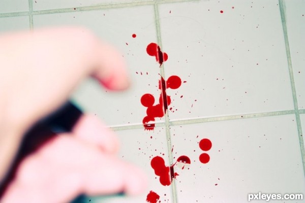
We made our point - created by StuporMundi


We made our point
Favs: 0SBS: n/aHi-resRank: 12/34Score: 64% (0)14994 views

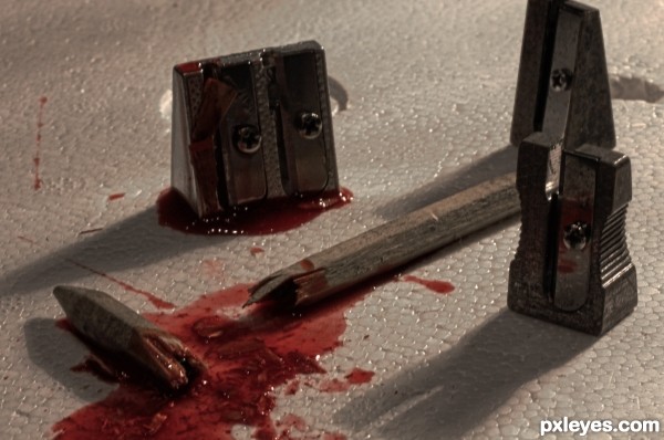
After all the unwanted penetration by Don Pencilio and his family the Sharpeners had had enough. This was the only consequence seeming logical.

I put this together from three differently exposed pictures I took. Hope you enjoy it. (5 years and 2580 days ago)

avatar karaflazz
karaflazz says:

Nice story telling photo with some room for improvement tho.
The b/g (background) should be a better choice (something that looks like a road or an alley since they are the "mafia".
Lighting should be more "mysterious" IMHO & a wider frame so the sharpener on the top is included.
With a little more attention to some small details next time you will surely do better.
All the best author!!!

author says:

Thank you very much for your honest & useful comment.
I had actually thought about the use of a road as well and a more Sin City-like look, but this is all I was able to end up with at the late hour I took the shot. ^^
This being my first entry I sure hope there will be a lot more and improved pictures.

(5 years and 2579 days ago)


avatar perfectway76

Disclaimer: pencils WERE harmed in the making of this photo! Wow, great image!

author says:

Thanks a lot. Actually it all went pretty fast, the pencil did not feel a thing.

(5 years and 2579 days ago)


avatar teecee
teecee says:

what did you use for the blood - looks very realistic - good shot

author says:

Thank you for your comment.

I used a mixture of movie blood by Kryolan (professional make up company from Germany), strawberry jam and pieces of the sharpened pencil.

(5 years and 2579 days ago)


avatar friiskiwi
friiskiwi says:

What do you mean when you say, you took 3 different photos?

author says:

I fastened the camera upon a self build heightening so it wouldn't move a bit.
Then I took a three pictures on three different levels of exposure to gain a greater dynamic range.

(5 years and 2578 days ago)


avatar Chrys Rizzo

Like the texture

author says:

Thank you!

(5 years and 2577 days ago)


avatar kyricom
kyricom says:

Does this violate the site's rules on graphite, er... graphic violence? Better be careful or P.E.T.A. will get after you (Pencils Escaping Terrible Actions)

Howdie stranger!
If you want to rate this picture or participate in this contest, just:

LOGIN HERE or REGISTER FOR FREE


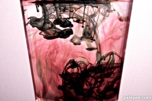
blood staines - created by Eris


blood staines
Favs: 1SBS: n/aHi-resRank: 5/34Score: 62.2% (15)6592 views

(5 years and 2678 days ago)

avatar kyricom
kyricom says:

Nice one

Howdie stranger!
If you want to rate this picture or participate in this contest, just:

LOGIN HERE or REGISTER FOR FREE


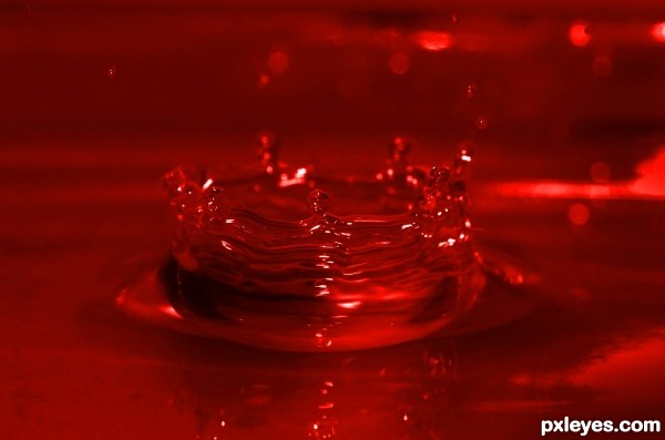
Blood is thicker than water. - created by Leanord


Blood is thicker than water.
Favs: 0SBS: n/aHi-resRank: 17/34Score: 59.9% (0)6502 views

(5 years and 2703 days ago)

avatar lincemiope

very nice the idea and its execution, bravo

Howdie stranger!
If you want to rate this picture or participate in this contest, just:

LOGIN HERE or REGISTER FOR FREE


Like Blood - created by alessandro


Like Blood
Favs: 2SBS: n/aHi-resRank: 34/34Score: 60.7% (0)4988 views

(5 years and 2766 days ago)

avatar mushaakon
mushaakon says:

great color matching....

Howdie stranger!
If you want to rate this picture or participate in this contest, just:

LOGIN HERE or REGISTER FOR FREE


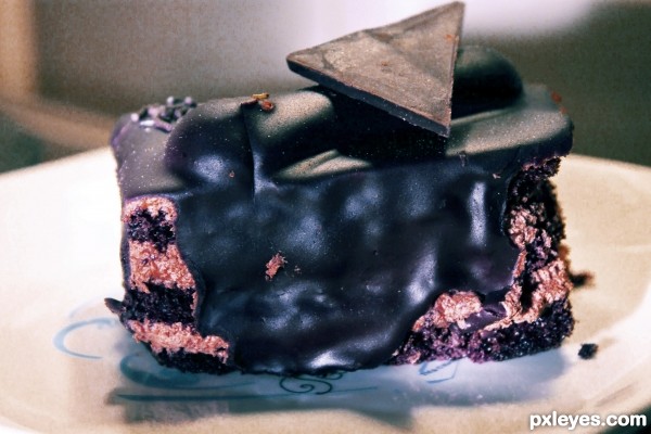
Watch yr blood sugar - created by jerostone


Watch yr blood sugar
Favs: 0SBS: n/aHi-resRank: 13/34Score: 61.9% (0)9192 views

(5 years and 2938 days ago)

avatar friiskiwi
friiskiwi says:

Try lightening it a little and warm up, eg. increase reds, at present it does not look like something I would like to eat.

author says:

I did try to make amends, friiski, but, well...

avatar JoeCacia
JoeCacia says:

Yummy black chocolate! My favorite!!!! Now it looks much better author with cutting the edges you gave it a unique taste too!

avatar friiskiwi
friiskiwi says:

That is looking better, but still a little too green, if you go to My profile, and look at my albums, I have uploaded some screen shots on how to improve the colour cast using curves.
The photos are in the wrong order, but numbered 1.2.3
good luck

avatar riady
riady says:

I do agree with Friiskiwi suggestion to remove the colour cast. At the moment, it's a bit greenish. When the colour cast have been removed, the idea of showing inner side of the chocolate would be a great concept

author says:

Thank you, JoeCacia and riady. I'll give it a try, and let us hope it won't tilt toward... reddish

avatar friiskiwi
friiskiwi says:

You are certainly working hard on this one, got rid of the green but too much magenta, try a Hue/Saturation layer and reduce the Magenta.

Howdie stranger!
If you want to rate this picture or participate in this contest, just:

LOGIN HERE or REGISTER FOR FREE