(5 years and 2498 days ago)
Photography and photoshop contests
We are a community of people with
a passion for photography, graphics and art in general.
Every day new photoshop
and photography contests are posted to compete in. We also have one weekly drawing contest
and one weekly 3D contest!
Participation is 100% free!
Just
register and get
started!
Good luck!
© 2015 Pxleyes.com. All rights reserved.

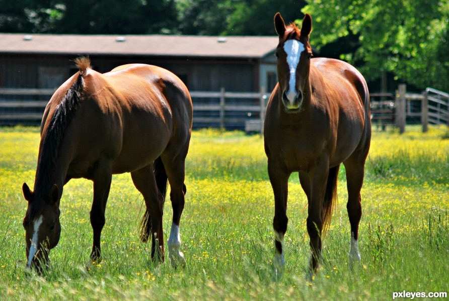
I love the lighting. In my opinion this photo could be improved by more room on the left as the horse seem tight to the frame when the other has so much room.
I agree, but I wanted the horse with the "buttercup lip" to be the focus. Otherwise, I would have kept more open space to the left, especially since the horse was kind of facing off to that side. I'll have to take a look at the original to see if I cropped off much on the left.
Howdie stranger!
If you want to rate this picture or participate in this contest, just:
LOGIN HERE or REGISTER FOR FREE