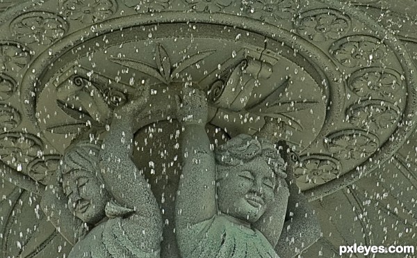
Thei highest part of the fountain starts the trickle down effect. (5 years and 3574 days ago)

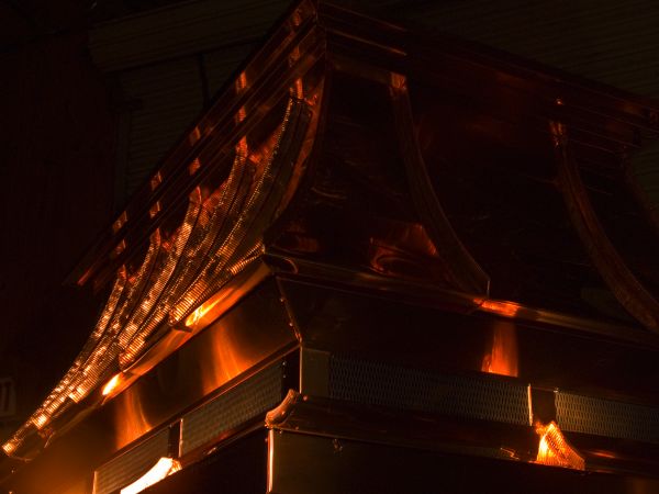
This is my favorite shot of a chimney cap that i designed and built from flat sheets of 20oz copper. The finished dimentions were approximately 7'long by 4'wide and 4' tall. As I built this the copper is covered in a sheet of plastic as to not scratch the metal. After it was all put together I peeled all the plasic off (this took hours in itself) I turned the lights off in the shop and used a flashlight to illuminate the copper. What you are looking at is a view from one of the corners. I have full pictures of this piece installed and I am most proud of the job I did on this. It is truly a one of a kind. (5 years and 3735 days ago)
Photo is a little dark to show the true beauty of your work.
Have to agree with friiskiwi, though can relate to you passion to your work
beautiful work and capture
Howdie stranger!
If you want to rate this picture or participate in this contest, just:
LOGIN HERE or REGISTER FOR FREE

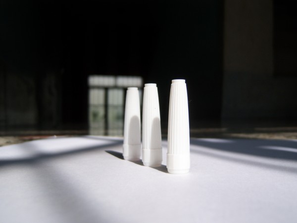
White means purity, white means peace.
I use sketch pen cap to bring out the purity of color. (5 years and 3740 days ago)
Beautiful
nice interpretation of the theme, well executed, well done.
very nice author
nice
I think a different background would have improved it.
Howdie stranger!
If you want to rate this picture or participate in this contest, just:
LOGIN HERE or REGISTER FOR FREE
Howdie stranger!
If you want to rate this picture or participate in this contest, just:
LOGIN HERE or REGISTER FOR FREE