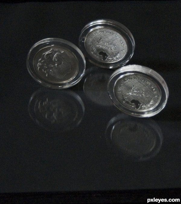
Plastic sealed silver coins (5 years and 3544 days ago)
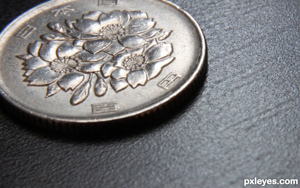
Flowers on the coin (5 years and 3641 days ago)
I am not sure about the coin at the corner, all shy and cropped...
have to agree with mperri, but nice coin.
In my opinion, subject in the center of the picture is a bit boring so for this composition I used Rule of Thirds. And that coin is not the main subject, so i'm not worried about the coins borders. I tried to focus on the flowers. But anyway thanks guys for the comments, I appreciate that. Next time I will think about your suggestions. Thanks again.
nice
Thanks guys.
Done perfectly...the edges of the coin are the focus and aren't needed here...good comp and dof, well done
Howdie stranger!
If you want to rate this picture or participate in this contest, just:
LOGIN HERE or REGISTER FOR FREE
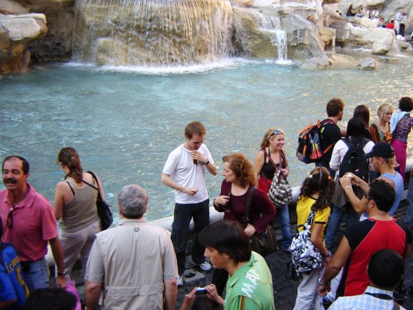
and you'll come again to... what city? guess (5 years and 3679 days ago)
Trevi fountain, Rome
ummmmm.... Point Barrow, Alaska? 
That's it kiricom,and it was a very sunny day! ...
Howdie stranger!
If you want to rate this picture or participate in this contest, just:
LOGIN HERE or REGISTER FOR FREE
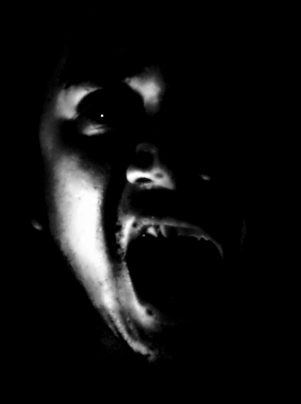
caught this picture during playing spirit of the coin..we asked for the spirit's permission to take 'his' picture and this what we get...... (5 years and 3731 days ago)
Howdie stranger!
If you want to rate this picture or participate in this contest, just:
LOGIN HERE or REGISTER FOR FREE
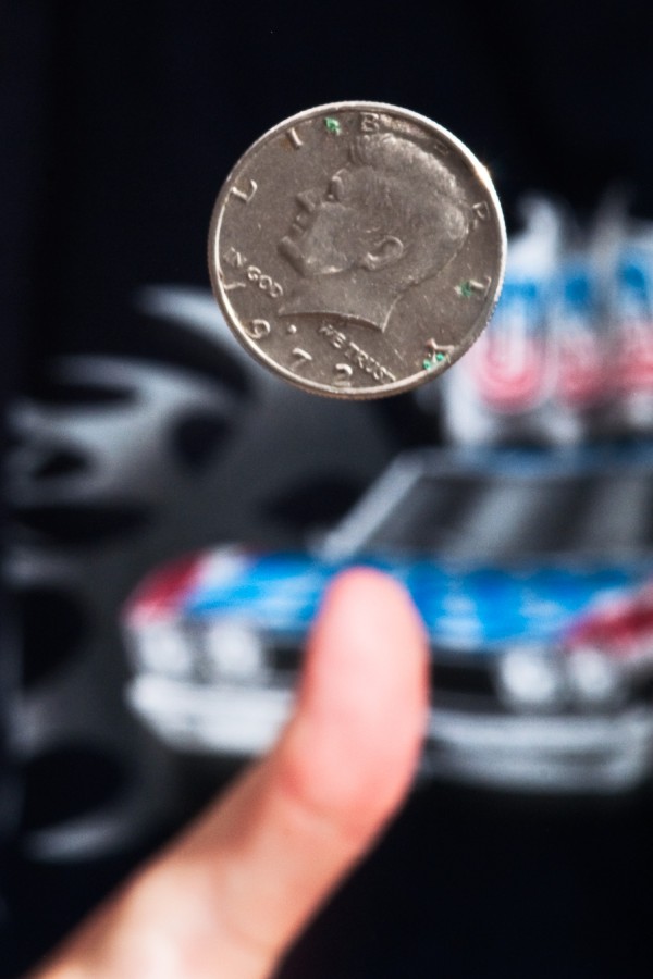
Took me about 50 attempts to get this shot. Most of the time I missed the frame followed second by shots where the coin was not in focus. A final handful was okay but I got the rim instead of heads or tails.
This is a half US dollar btw. (5 years and 3758 days ago)
Practice makes perfect.
Nice, but the background is disturbing.
@Artifakts: I used a neutral background (i.e. T-Shirt) first but it didn't add depth to the image. It looked like a strange, weird close-up with a blurry thumb out of nowhere so I switched shirts..
In fact (imo) it's the blue which is very intense and keep the attention out of the most important : the money and the finger.
I agrre with Arti here, the blue is the dominant color here, and does distract you. good attempt though!
Howdie stranger!
If you want to rate this picture or participate in this contest, just:
LOGIN HERE or REGISTER FOR FREE
You should have cropped out that black bar but there is really a lot a grain and noise in this shot.
Howdie stranger!
If you want to rate this picture or participate in this contest, just:
LOGIN HERE or REGISTER FOR FREE