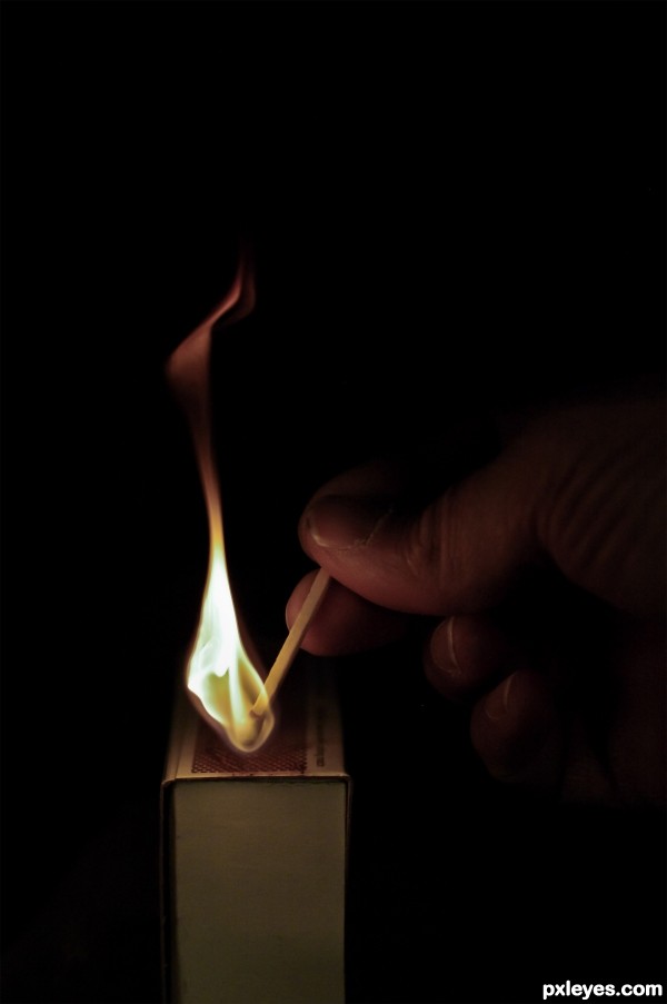
It's better to light one match than to curse the darkness. (5 years and 2708 days ago)
(5 years and 2746 days ago)
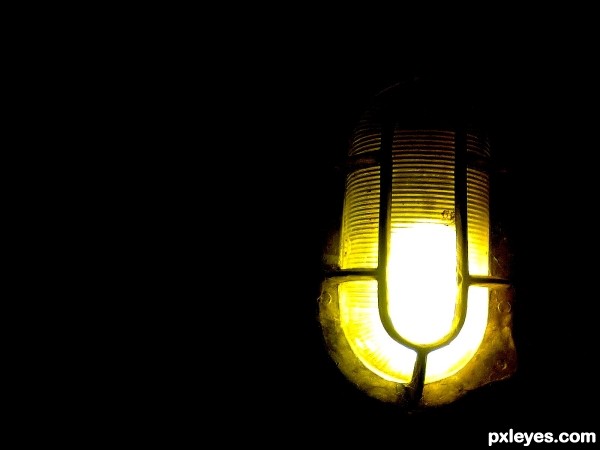
Nice capture, but it would have been even better if the lines of the light were level, the slight downward tilt to the right throws the visual balance off a bit.
My English is quite poor, so I hope I'll be able to reply correctly. I'm not very familiar with photoshop, I did this in Picasa. But I understand the advice, I know it would be much better. As soon as i have more time i will deal with Photoshop.
Howdie stranger!
If you want to rate this picture or participate in this contest, just:
LOGIN HERE or REGISTER FOR FREE
(5 years and 2788 days ago)
Howdie stranger!
If you want to rate this picture or participate in this contest, just:
LOGIN HERE or REGISTER FOR FREE
(5 years and 2815 days ago)
Howdie stranger!
If you want to rate this picture or participate in this contest, just:
LOGIN HERE or REGISTER FOR FREE

(5 years and 2895 days ago)
Nice... but a little blurry
Howdie stranger!
If you want to rate this picture or participate in this contest, just:
LOGIN HERE or REGISTER FOR FREE
Howdie stranger!
If you want to rate this picture or participate in this contest, just:
LOGIN HERE or REGISTER FOR FREE