live snake (5 years and 3367 days ago)

(5 years and 3384 days ago)
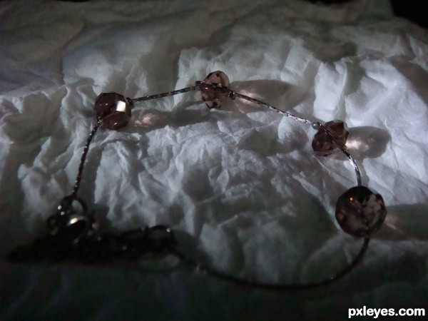
the lighting is awkward author, and its slightly oof
Do u knw to praise any1 "Crystleclear"?
Really Crystle? Yet another one of your comments that is strictly critical and offers no element of value or constructive criticism. If you cannot assist the author with advice on making the photo quality better, then don't say anything at all. Didn't your mother ever teach you that if you can't say anything nice, then don't say anything?
I am new to this photography stuff so I don't have lots to offer as far as advice goes. I am sure that some of the others will offer some more technical advice.
Good Luck Author!
thanks rbsgrl thanks for your support have a niceday!!!!!!!!!!!!!!!
I must agree with crystleclear, the picture just is a bit out of focus. As far as constructive criticism for this point, just take the shot again, perhaps with a tripod to keep the camera completely steady.
As far as lighting, the picture is too dark; it could use stronger lighting. The angle of the light is excellent though, and I love the coloured shadows. The object itself is just lost to darkness and blur.
Howdie stranger!
If you want to rate this picture or participate in this contest, just:
LOGIN HERE or REGISTER FOR FREE

(5 years and 3385 days ago)
Howdie stranger!
If you want to rate this picture or participate in this contest, just:
LOGIN HERE or REGISTER FOR FREE

(5 years and 3549 days ago)
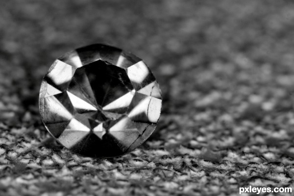
nice macro
Great idea... would've liked to see a little more play of light in the facets
Thanks kyricom...any tips for lighting a diamonds facets??? it's not as easy as it appears...any help would be appreciated
Laser pointer?
A laser pointer to light up a diamond??? never thought of that...will have to try it
Howdie stranger!
If you want to rate this picture or participate in this contest, just:
LOGIN HERE or REGISTER FOR FREE
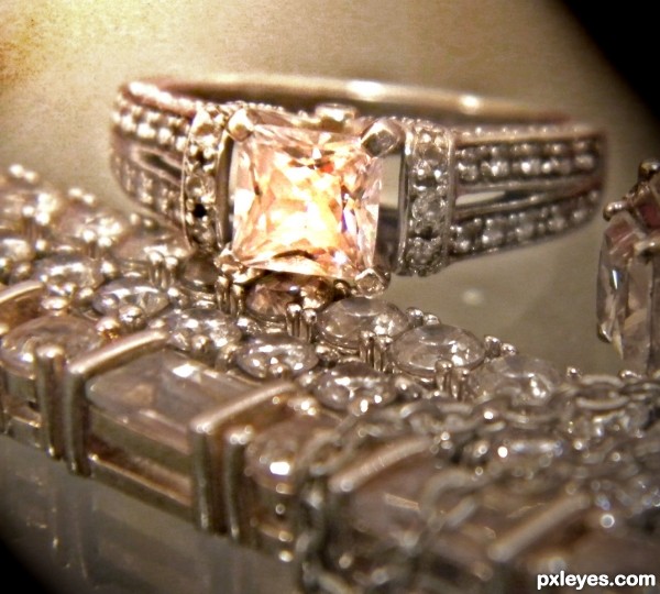
author, it would be a really good idea to rotate your picture so its upright.
agrees
I think a better idea would have been to crop it, so that we couldn't guess that the person is standing, which wouldn't have made necessary the need for rotate.
Love the image so much...but agree with others about rotate...gl author
Howdie stranger!
If you want to rate this picture or participate in this contest, just:
LOGIN HERE or REGISTER FOR FREE