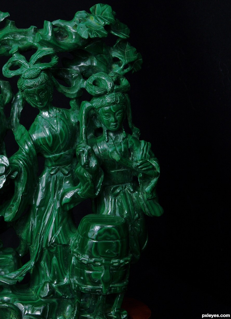
These hand carved Malachite drummer figures are from around 1910. They are about 4 inches (10 cm) tall. (5 years and 3136 days ago)
Photography and photoshop contests
We are a community of people with
a passion for photography, graphics and art in general.
Every day new photoshop
and photography contests are posted to compete in. We also have one weekly drawing contest
and one weekly 3D contest!
Participation is 100% free!
Just
register and get
started!
Good luck!
© 2015 Pxleyes.com. All rights reserved.


There's an excess of empty space on the right hand side, while you cut off the left side of the statues...It looks like you didn't know how to aim your camera...
Beautiful color and clarity, but the cut off side really lessens the impact.
Thanks for your comment. Yes, you are right. The negative space on the right draws the eye to the left, where the figures are not entirely in the frame, implying movement. That was the intent, anyway.
I like the cropping, adds intrigue to the image.
I actually like the "dead space" on the left, but then again, I've never been one for symmetry
Howdie stranger!
If you want to rate this picture or participate in this contest, just:
LOGIN HERE or REGISTER FOR FREE