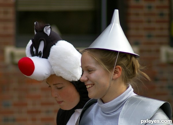
Fancy hats don't always show you're sophisticated! (5 years and 3214 days ago)
(5 years and 3281 days ago)
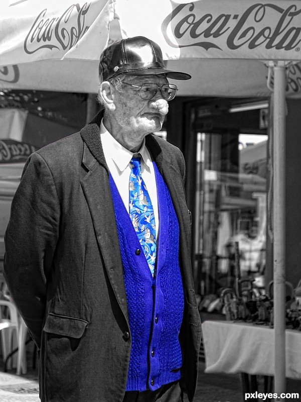
A bit of the bottom edge of the sweater could use a touch up -- nice picture
fixed!
What's wrong with his nose? Great shot !
I guess it is some type of tumor........I couldn't resist shooting.........
my uncle had a nose similar to this mans...not quite as bad. He had cancer and just recently had his nose removed and a new one constructed for him. Poor guy 
Poor bloke - at least he still seems to have his sense of humour - I mean, check out that tie 
you should have seen the other colors in it............. 
Howdie stranger!
If you want to rate this picture or participate in this contest, just:
LOGIN HERE or REGISTER FOR FREE
(5 years and 3284 days ago)
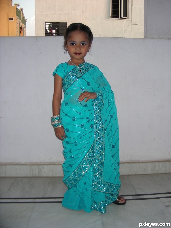
Very cute girl...
beautiful outfit and a beautiful little girl
What a cutie, just wish you had a different background, either totally plain or something interesting.
very cool shot author...gl
I agree with friiskiwi. If you had moved her over to the right (or her left) you probably could have had an all white background it looks like.
Howdie stranger!
If you want to rate this picture or participate in this contest, just:
LOGIN HERE or REGISTER FOR FREE

(5 years and 3287 days ago)
BEAUTIFUL SHOT!!
amazing shot! i love the urban style, simply because it is a style I wear also! It is quite popular in my city (brooklyn, ny). all the males in my family dress urban (since im a mix of jamaican and italian) - i really appreciate the urban style showcased in this fashion photography contest, thank you author for making it shine in a brilliant way!
Superb shot, worthy of a fashion mag, the lighting is excellent. Well done author.
Awesome light textures and the pose of the model, well done =)
Author, the rim-lighting is superb...great set-up and location, just need a hint of spot-lighting on the face to make this BAM! magazine worthy...sincerely great job
I disagree with mymoment, It is perfect just the way it was shot, again GREAT job!!
Fantastic!
I have to agree with itsmymoment on this one because the man is a very handsome guy and his face isn't highlighted enough--it's kind of flat. But this is an awesome picture as it is! And I have to say that the posing is PERFECT! It looks natural and comfortable for him (I get OCD about posing sometimes)
edit: next time I would wipe off the back of his shirt though after posing him against things 

Well thank you for you brutal critiques 
Actually I agree with Kellie and James, the one thing that bugs me about this photo is the light on his face. There are two reasons why it is like this, first is inexperience. I had never photographed a person with dark skin before this shot so I had some exposure issues, the second is lack of equipment. At the time of this photo i didn't have a lot of the equipment that I have now, I only had 1 external flash and even though I did use it here I couldn't dial it up enough to expose his face the way I wanted without washing out his clothes. If I could go back again I would fix it for sure. As far as the dust goes.... that was just me not looking at the details. 
really well done, great pose and lighting
congrats yours was by far my favorite!
Congrats
Howdie stranger!
If you want to rate this picture or participate in this contest, just:
LOGIN HERE or REGISTER FOR FREE

(5 years and 3288 days ago)
very nice! and she's got beautiful eyes!
beautiful shot...gl author
Howdie stranger!
If you want to rate this picture or participate in this contest, just:
LOGIN HERE or REGISTER FOR FREE
cute
Howdie stranger!
If you want to rate this picture or participate in this contest, just:
LOGIN HERE or REGISTER FOR FREE