(5 years and 3221 days ago)
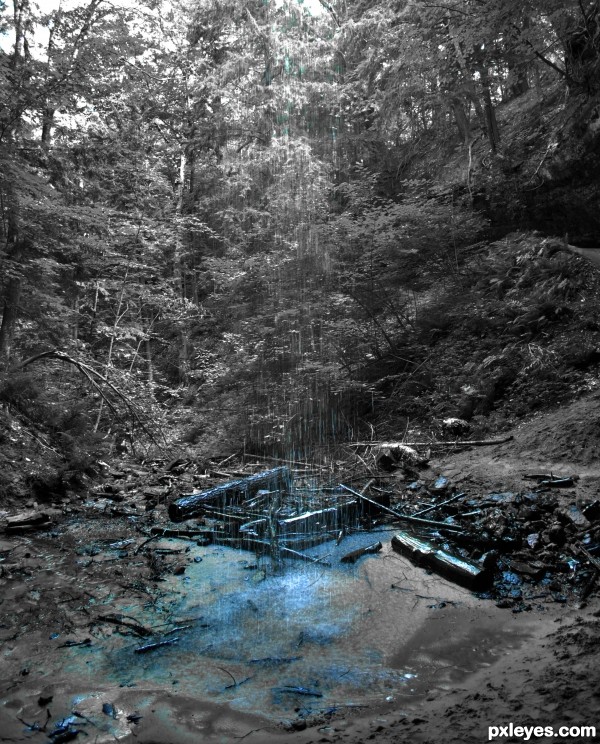
I realize you can't see much of the falling water because it takes on the green color of the trees behind it, but there was something about the way the blue looked on the ground that I thought was neat. Here is a picture of it from the front (courtesy of "Steve" ?) http://home.comcast.net/~ratburt/web/falls/upper/memorial.html (5 years and 3229 days ago)
If you read the changed goal, you will find the water doesn't have to be blue. I would work a little more on this one. GL
I understand the goal but if I leave in any other color, other parts of the photo besides the water will not be black and white. Since the water is taking on the color of the trees which is green, then half the photo would be colored, not b&w. Now, if we are allowed to do this other than just desaturating all levels except a particular color, for example with masks and erasing only parts of layers, then I could definitely do that.
The water in the middle has no color at all, green, blue, or otherwise. Since you choose the photo you take, you need to keep the background in consideration, since this looks half-baked at best, with a bit of blue at the top, nothing in the middle, and a lot of blue at the bottom. If the way it looked on the ground is what "talked " to you, then crop off the distracting and desaturated top and focus on the water on the ground.
Hey I've been here!
While I do believe it would have been better if the fall itself could have retained color I understand why it is not. Calling it "half baked at best" is wrong and just plain rude. It may help to crop out the top to below the rock, but I still think this is a nice image.
I thought about cropping it but didn't know if anyone would flag it saying that it wasn't a waterfall, so I didn't.
I agree with locksmagic as well. When I first saw the photo, I was really intrigued by the colouring because it wasn't even. When water get thin, it becomes clear, so you can't really expect ALL of the water to have colour.
It's a unique image that you have to look at twice to locate the water source. Thin amounts of water shed little color so for me, i like it.
Howdie stranger!
If you want to rate this picture or participate in this contest, just:
LOGIN HERE or REGISTER FOR FREE
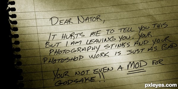
levels - cropping - (5 years and 3231 days ago)

It's okay, she can't spell "you're..." lol!
I love it! And surprisingly good penmanship. :P I'd pull the crop out at the right though; it seems a little too close to the copy. All the best!
LMAO 
like it author good luck
Oh boy! LOL, tell your wife thank you for the smile, you did a wonderful job author! Truly lovely! 
Kudo's my friend, fantastic idea. Love the way you have it lit.
Congrats Nator, lovely entry.
Congrats
Howdie stranger!
If you want to rate this picture or participate in this contest, just:
LOGIN HERE or REGISTER FOR FREE
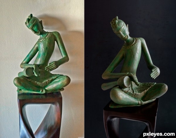
What I have learnt, it's always a good idea to have a tripod handy. (5 years and 3238 days ago)
Think everything is better on this -- lighting, composition and focus == well done
Much more dynamic now!
It's a great improvement, the light, the background...
Just the angle change I do not really like. But that could be my western look.
Let me explain:
I'm from Europe and used to read from left to right and that's how I learned to 'read' a photo (matter of fact any image) too. Due to the change in the angle the hands (a focal point in this photo) are closed to me, in your original photo they are open and therefor, to me, a much more friendlier angle to look at. 
Rob, that's a really interesting point of view, something I haven't considered, but will keep it in mind from now on and see how I actually look at a photo. Thanks.
Much nicer. Great job. Interesting perspective, Rob. But... the new way the face is also facing us more, becoming more "open" and inclusive (nonverbally)
I also like the new angle better, because it makes the visual movement much more fluid, where in the first image, it was somewhat "jerky," with the eye stopping at every angle of the elbows and knees. I also did not like the profile view of the head. The new angle provides a much more complete view of the face, as well as the drum, and the angles of the joints just "flow" better...
great improvement, the second image is great! 
Howdie stranger!
If you want to rate this picture or participate in this contest, just:
LOGIN HERE or REGISTER FOR FREE
(5 years and 3238 days ago)
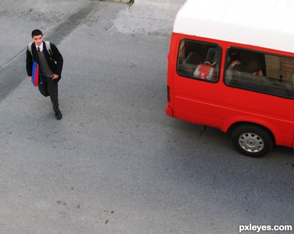
You caught him at just the right instant that he looks like he only has one leg and is leaning as if he's starting to fall over! 
Howdie stranger!
If you want to rate this picture or participate in this contest, just:
LOGIN HERE or REGISTER FOR FREE
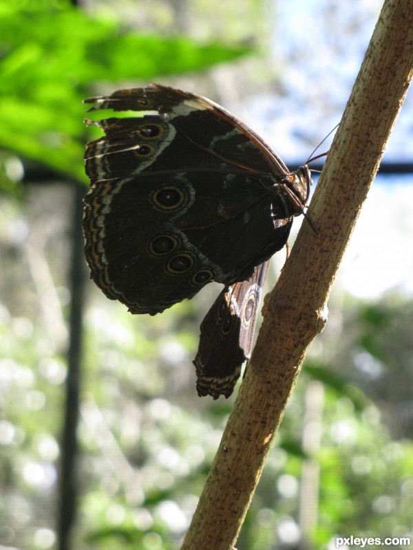
A good try and nice leading lines, just a shame you weren't on the other side of the butterfly, being in the shade, you have just lost too much detail. I guess the camera was trying to expose for the light behind.
Although the lighting would have been better, I think it would have been a much sadder photo, as the wing on the other side looks to be damaged, most likely from a bird, judging from the tears on the wing facing us...Poor butterfly.
You can still do some work on the photo, crop it closer and lighten the butterfly to show some detail. If you don't crop, you will have to many blown highlights.
Howdie stranger!
If you want to rate this picture or participate in this contest, just:
LOGIN HERE or REGISTER FOR FREE