(5 years and 2815 days ago)

(5 years and 3088 days ago)
Darn, I just took a very similar photo, but yours is so much better, I won't be entering mine. Back to the drawing board.
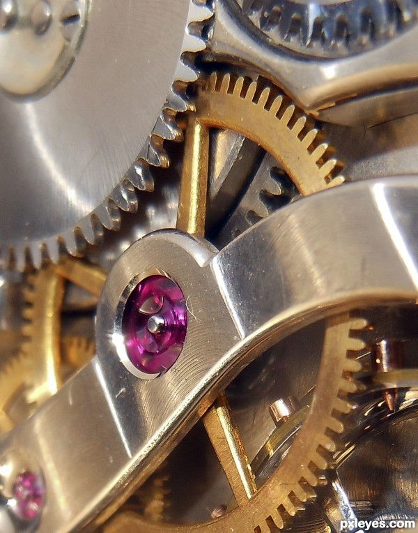
People!!!! Pay attention..... This is a macro!! Very good!
Thank you both very much
This is a macro !!! This is great shot.
Curious as to the camera used and the settings. GREAT JOB. good luck.
Thanks for your comments. Taken with a Tokina macro 100 mm at F 11 at exposure 1.2. I took dozens of shot set ups to eliminate reflection.
Howdie stranger!
If you want to rate this picture or participate in this contest, just:
LOGIN HERE or REGISTER FOR FREE

(5 years and 3362 days ago)
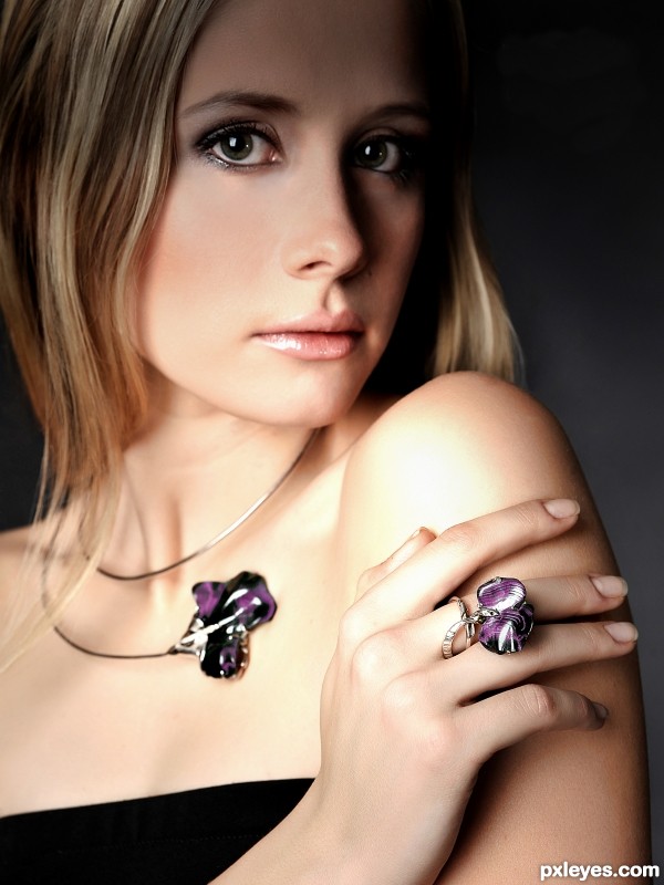
Beautiful, simply beautiful. What a stunning model and I like our lighting. One thing I'd change though is to lighten the right side of her face, I don't like that her forehead is in shadow. But other than that this is superb.
I appreciate your comments, especially the one about her face in shadow. This was deliberate........... the shot was set up this way to emphasise the gems. My idea was to keep just part of the face a little darker to give it a little 'mysterious' effect. The client did actually want more of the face to be darkened, but I did not like this idea.
This was shot number 89 out of about 130....... a lot of the others were and will be used, but this one best suited the theme it was shot for.
Fantastic photograph! Thx for the explanation, I think it will help us newbies!
beautiful jewelry!! and fantastic shot!
Beautiful, just wish the necklace was a little sharper
Each one of the series of shots was done to emphasise a particular piece of jewellery. In this case, the ring was the subject, in another shot, the necklace was the subject, and so on...there are also one or two in which the ear rings were the main subject. The dof was set in each instance to accommodate this.
very beautiful.great shot
I think it's perfect !!
wow.
this is definitely what i expected from this contest. something JUST LIKE THIS!
well done. and i love the focus. truly meant for an advertisement in some jewelers catalog!
the first thing I noticed was NOT the jewelry, it was the shadow on her beautiful face  I like the concept of trying to make the emphasis more on the jewelry, but because it isn't sublte enough, the shadow overpowers the rest. Still a great shot though!
I appreciate you comments, but the shot was taken tis way deliberately. and as it was used by a very high profile company for their advert, I cannot complain
In my humble opinion - the shadow and highlight on her shoulder make the photo
Fabulous fashion shoot....it reminds me on the pages of jewelry magazines...GL author
That is what it was shot for......... 
Great gems author, all 4 of them, GL
ya know, I'm think that if this is in their catalog that has a black background, the shadow probably wouldn't be as noticible. Still though it is a great shot!
Having made jewelry for 35 years, if I wanted a shot to emphasize one of my rings... this would be a great one. (If I wanted a shot to emphasize a girl's forehead - not so much! 
Thank you Kyricom, I was rather hoping you might comment, cos I remember you said you were a jeweller in a past life...... your comment means much to me. 
The shot was always about the ring, not the forehead.
Congrats
Howdie stranger!
If you want to rate this picture or participate in this contest, just:
LOGIN HERE or REGISTER FOR FREE
Howdie stranger!
If you want to rate this picture or participate in this contest, just:
LOGIN HERE or REGISTER FOR FREE