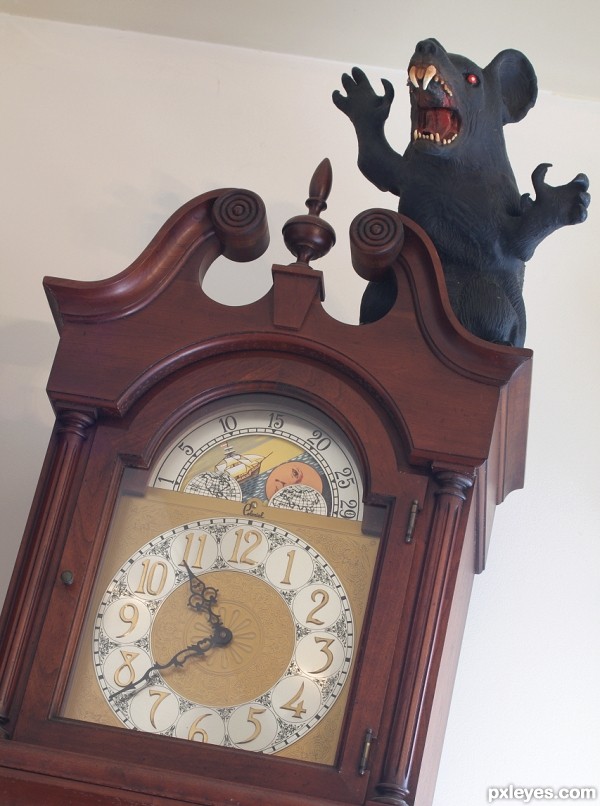
Hickory, dickory, dock,
The mouse ran up the clock.
The clock struck one,
The mouse ran down,
Hickory, dickory, dock.
(yes, the angle is on purpose) (5 years and 3135 days ago)
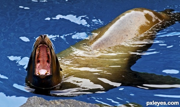
(5 years and 3144 days ago)
Well nobody said it had to be a pool for humans, nice shot and take on the theme.
Howdie stranger!
If you want to rate this picture or participate in this contest, just:
LOGIN HERE or REGISTER FOR FREE
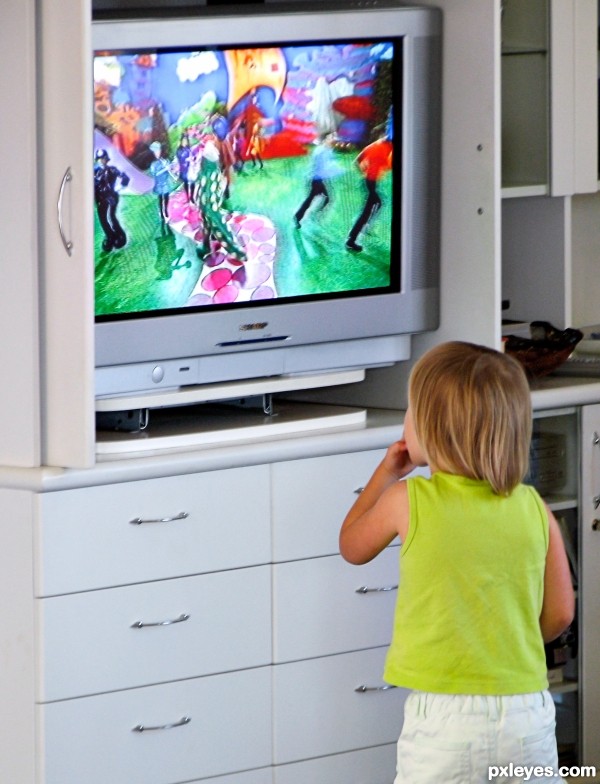
(5 years and 3204 days ago)
Howdie stranger!
If you want to rate this picture or participate in this contest, just:
LOGIN HERE or REGISTER FOR FREE
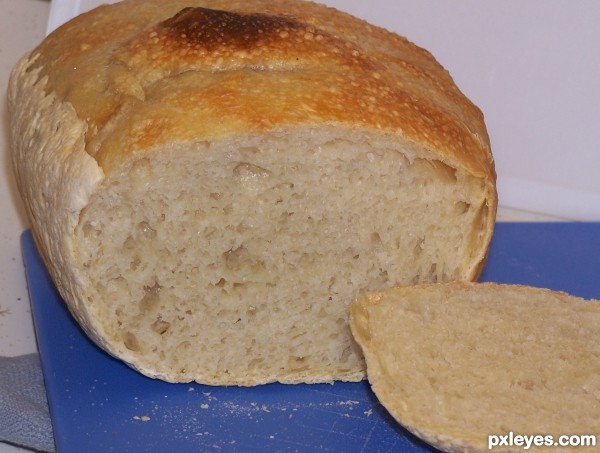
My first adventure into "no knead" bread, where you dump the ingredients into a gallon zip-lock baggie, and let it sit at room temperature for 20 hours, and then bake it in a very hot oven. (5 years and 3210 days ago)
Nice! If you haven't eaten it all up already, you may want to consider re-shooting. Remember your background is as important as your subject. Maybe move the bread all the way in front of the white backgroun on the right side. I really like the blue cutting board, it brings a pop of color to the otherwise colorless subject. If you can't re-shoot, maybe consider cropping a little tighter on the right. Good Luck!
Fresh baked bread never lasts long around the house. I was lucky to get any photos at all! Thank you for the suggestion, I've re-cropped the best I could with what I had. It is fun to learn from your mistakes...I think... 
Great advise Sheri! Nice change Author
The ignorant soul that I am, I just wish I knew how one can tell the difference between homemade bread and that bought from the bakery round the corner, judging from a picture. A world full of mysteries! Other than that, nice try, author.
At least compared to my baking, the stuff from the bakery always looks better, because they do it enough to make it a "standardized" visual "perfection." They don't sell stuff with toasted edges, or wrinkled sides... 
And of course, just like any of the contests here, if someone wants to cheat, they'll find a way. I sure wouldn't pay bakery prices just to take a photo for a contest here, but that's just me...
Cheating? Perish the thought! I was just wondering, that's all.
The loaf looks good enough to eat.
Nice try but Rbsgrl is right : background is very important. The bread crumbs, the towel ...
I know the rules are made to be bypassed but the color blue and food are not good friends !
The cropping is also too tight on the top left part. Either you cut the bread, either you let it breath.
My blue cutting board's feelings are hurt! LOL!
When I took this photo, it was to document one of my better baking attempts - I'm not a great culinary whiz, and although the stuff gets eaten, it seldom to never looks "professional" quality. I was thrilled that this loaf did look good enough to eat...
It's only now, as I am attempting to learn to take more than "snapshots," that I am learning things "photographers" take for granted, like:
1. Get everything unnecessary out of the AO before you take a picture, and
2. Take a moment to compose your photo before pressing the shutter, and
3. Try to have good even lighting, illuminating the entire subject, not just one end...
But I'm learning through my mistakes.
Nice looking bread. You can still work on the composition suggestions of those above by some judicious cropping. I would recommend taking some from the left (to where the blue cutting board touches the bottom frame) and some from the top to keep proportion. This will draw the eye to the bread, and only have a little area of blue and white for contrast. Good luck.
Howdie stranger!
If you want to rate this picture or participate in this contest, just:
LOGIN HERE or REGISTER FOR FREE
(5 years and 3247 days ago)
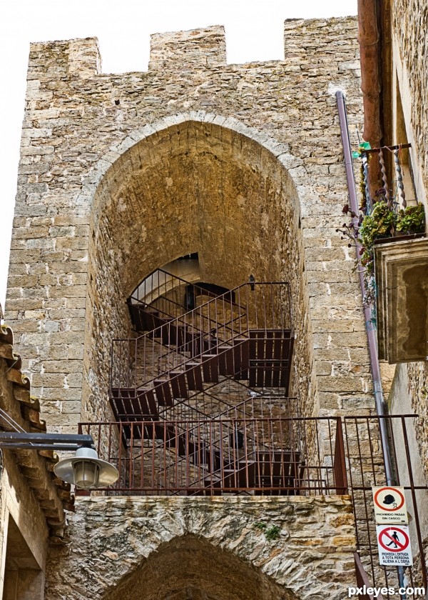
The sky looks too washed out, and the signs are a bit distracting, but this is a beautiful set of stairs!
Sometimes, that's just the way the sky looks, I could of course easily have added a lovely blue sky, but that is not allowed. I did consider cropping the photo above the signs, but that made the photo looked unbalanced.
Thanks for you comments, they are appreciated.
Howdie stranger!
If you want to rate this picture or participate in this contest, just:
LOGIN HERE or REGISTER FOR FREE
I'm not getting him down, he can stay there! AAahhh!
Great chop!
well done
Howdie stranger!
If you want to rate this picture or participate in this contest, just:
LOGIN HERE or REGISTER FOR FREE