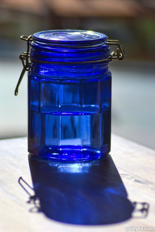
(5 years and 3058 days ago)
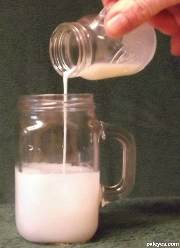
(5 years and 3059 days ago)
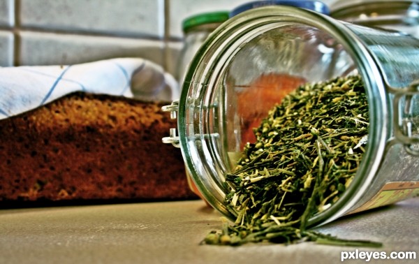
Your image is crooked, tilting down to the left. If you level it out, it will be a stronger presentation. I would also crop out the lid on the right. It is of a higher white value, and so it is distracting from your focal point of the jars by over dominating the image.
TYVM Mossy. Appreciate that 
Howdie stranger!
If you want to rate this picture or participate in this contest, just:
LOGIN HERE or REGISTER FOR FREE
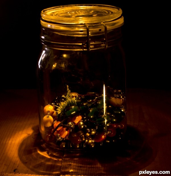
(5 years and 3061 days ago)
Nice lighting, but too yellow an overall tint - it looks somewhat jaundiced - a common problem with incandescent lighting. A cooling filter or color adjustment would help this.
lovely warm tones.
nice colors and lighting, great shot
Tjank you, enblanco
Howdie stranger!
If you want to rate this picture or participate in this contest, just:
LOGIN HERE or REGISTER FOR FREE
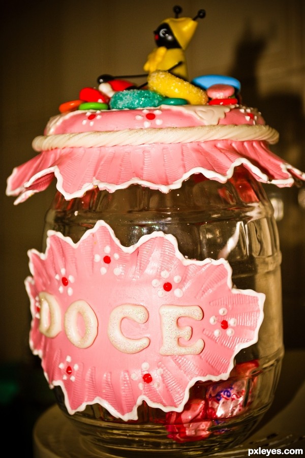
A beautiful glass vase decorated with handcrafted porcelain for candies and delights. (5 years and 3064 days ago)
Howdie stranger!
If you want to rate this picture or participate in this contest, just:
LOGIN HERE or REGISTER FOR FREE
HDR (5 years and 3086 days ago)
There's a bit too much of the "HDR halo" effect around the jar, which combined with the depth of focus blur of the other objects makes this a bit hard to look at. Perhaps dropping the contrast down just a wee bit to soften the highlights would help.
Howdie stranger!
If you want to rate this picture or participate in this contest, just:
LOGIN HERE or REGISTER FOR FREE
Howdie stranger!
If you want to rate this picture or participate in this contest, just:
LOGIN HERE or REGISTER FOR FREE