(5 years and 3134 days ago)
(5 years and 3135 days ago)
Author do you have a high res version? If so: it might be wise to upload that, it will for sure raise the votes on this entry 
Go here http://www.pxleyes.com/my-contest-entries/ if you want to change this entry.
may not be a very great click but dunno y i luv this one
Nice Congrats
Howdie stranger!
If you want to rate this picture or participate in this contest, just:
LOGIN HERE or REGISTER FOR FREE
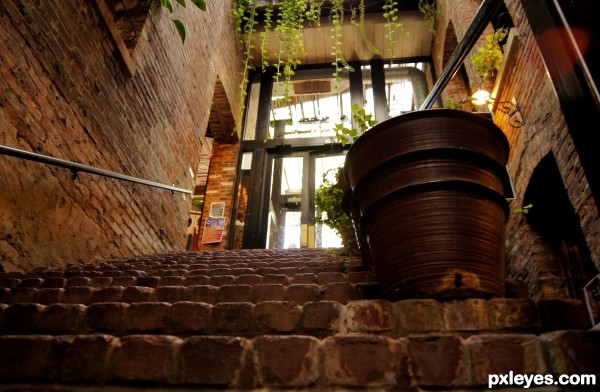
To me the lines from the brick steps, the wall, and the hand rail lead my eye to the passage way on the left of the stairs. Which I found interesting.
I'll be sure to go back when I have a friend to pose there. :) (5 years and 3138 days ago)
love the beautiful warm tones.
Howdie stranger!
If you want to rate this picture or participate in this contest, just:
LOGIN HERE or REGISTER FOR FREE
(5 years and 3146 days ago)
Howdie stranger!
If you want to rate this picture or participate in this contest, just:
LOGIN HERE or REGISTER FOR FREE
(5 years and 3146 days ago)
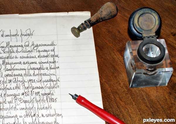
Beautifully done, but I think it would ahve more impact if you cropped it a lot closer.
Thank you Friiskiwi, I cropped a bit in the bottom, do you think I've to crop more?
Personally I would crop out most of the writing and a little of the right. Really cutting out 50% of the image. This is just my opinion, but it's about writing instruments, not about writing.
Good luck, and do what you feel happy with.
I would follow your suggestions, thanks again friiskiwi 
amazing...! the objects in the photograph giving me 3D appearance ! Particularly the stamp (i think its stamp) and the paper-weight/ink-pot on the side...
I don't know vaiibhavjain, I took this shot from the top, with the camera built-in flash on
In the hi-res you can see a thin shadow under the stamp and the pen.
I love the old tools but they seem unconnected. Nice idea and the handwriting is outstanding
There's no ink in the inkwell, and it seems too disconnected from the rest of the image, which is compounded by the positioning. If it had been angled about 45 degrees, the visual movement would have echoed the pen and stamp, making it more a part of the overall composition.
Howdie stranger!
If you want to rate this picture or participate in this contest, just:
LOGIN HERE or REGISTER FOR FREE
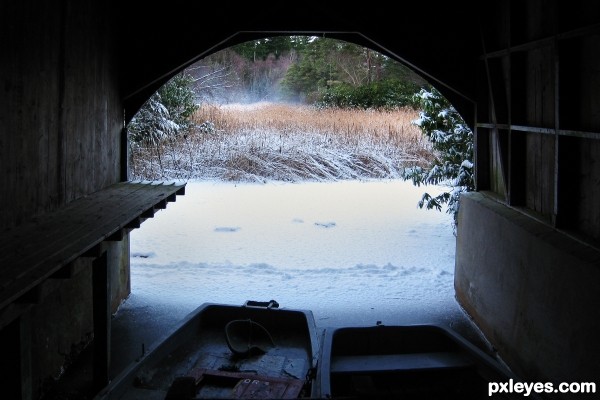
Nicely done, I love how you still have some detail in the boats.
Howdie stranger!
If you want to rate this picture or participate in this contest, just:
LOGIN HERE or REGISTER FOR FREE