(5 years and 3479 days ago)
Photography and photoshop contests
We are a community of people with
a passion for photography, graphics and art in general.
Every day new photoshop
and photography contests are posted to compete in. We also have one weekly drawing contest
and one weekly 3D contest!
Participation is 100% free!
Just
register and get
started!
Good luck!
© 2015 Pxleyes.com. All rights reserved.

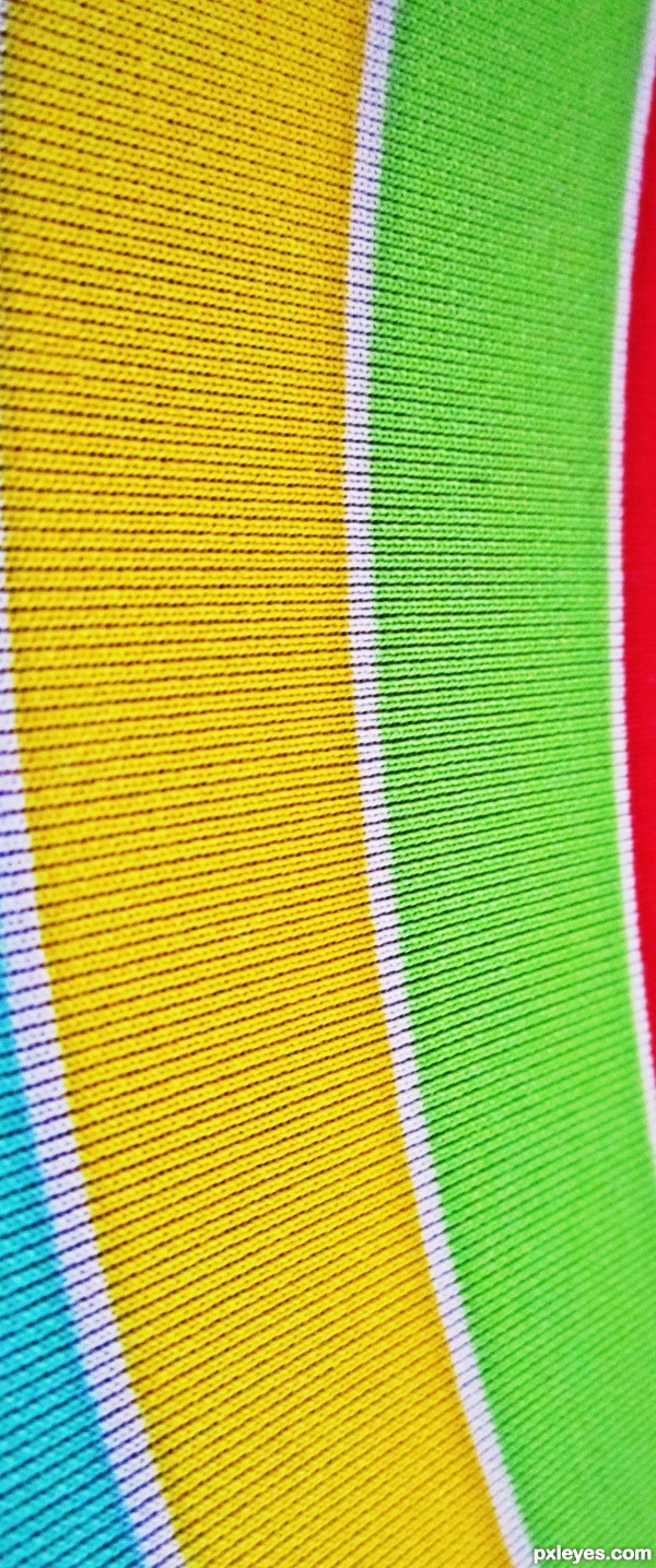
colours are nice -- there is no area of sharp focus -- which I thnk detracts from the image -- an area with sharp focus would maybe hold the eye with some interest.
I also like the idea, nice and simple. However I think that you should probably add a little more saturation and vibrance to make the image more lively.
Nice work author!
@ bart- i corrected the color... how is it now?
I agree with Alan. there is no sharp area of focus, basically creating a DOF, so this photo has no DOF. (Depth of Field)
I think this is neat actually. Colors and all. I like best that it curves.
thanks @ k5683
the focal point is in the centre where the shot is straightest, there is no particular area of dof, but, imo, this image does not need it.
You make a good point Ade. The pattern and colors are still very nice.
I like how it looks when you scroll down with the mouse - neat
Howdie stranger!
If you want to rate this picture or participate in this contest, just:
LOGIN HERE or REGISTER FOR FREE