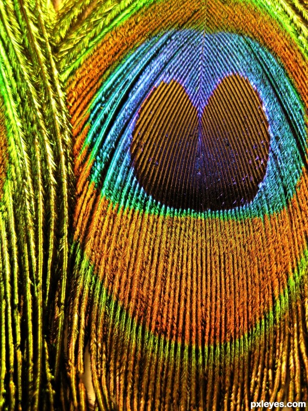
Close up work showing the detail of the stunning colours.Nothing else done to it. (5 years and 2830 days ago)
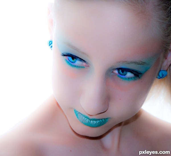
(5 years and 2845 days ago)
very nice -- contrast between the skin and the blue is great -- wonderful eyes as well
Nice photo, I don't like the editing though. The diffused affect doesn't suit this photo, also, her skin is quite blotchy
By diffused, are you referring to bright white behind ? The only editing done was slight adjustments to saturation, exposure brightening and clarity. Without selective editing, this seemed the only way to soften the leas then perfect teen skin. Suggestions welcome
the saturation blotches the skin, it look like you used a diffused filter on it, but that's probably due to all the other editing. The selective editing would have been better, this editing doesn't flatter the photo at all. The saturation definitely needs to come down.I would increase the contrast as well, and to be honest, you don't need perfect skin to have a perfect photo. I've taken portraits of dirty faces that were beautiful. Perfect skin is just societies ideal
By blotchy I assume u mean the harsh peach on forehead - and I can understand u seeing it that wat but it's actually makeup. The original purpose of this shoot was with peacock feathers and the blush accented the peacock feather. In this particular shot it does look different (as in not as good). Selective editing would be nice but alas against the rules.
@ dem90....if the author chose to do selective editing, yes...it would maybe have made a better image, but! it's aganst the photography rules here and if found by one of us Mods...the image would have been removed...
@ Author, fine image and entry indeed....well done IMHO, and bonus points for choosing to do the 'right' thing and stay away from violating the rules of the site as a trade-off for a slightly 'less-than-perfect' image...As far as I'm concerned...this is a great image, I favor very hi-key and low-key photos, this is a great example of hi-key portrait.
I really like, is elegant
Graze tanto!
Great impact at first sight! Cool image and a huge explosion of saturation. Maybe too much on her lips, but I like it a lot. Good luck author.
thank you 
Howdie stranger!
If you want to rate this picture or participate in this contest, just:
LOGIN HERE or REGISTER FOR FREE
(5 years and 2899 days ago)
Howdie stranger!
If you want to rate this picture or participate in this contest, just:
LOGIN HERE or REGISTER FOR FREE
(5 years and 2939 days ago)
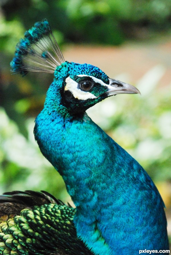
nice choice
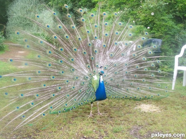
Best example on Theme...
Best example on Theme...
Howdie stranger!
If you want to rate this picture or participate in this contest, just:
LOGIN HERE or REGISTER FOR FREE
(5 years and 3005 days ago)
I feel this photo could be much better, increase contrast and darken, and then tick also save High Res so we can get a good look.
Howdie stranger!
If you want to rate this picture or participate in this contest, just:
LOGIN HERE or REGISTER FOR FREE
Howdie stranger!
If you want to rate this picture or participate in this contest, just:
LOGIN HERE or REGISTER FOR FREE